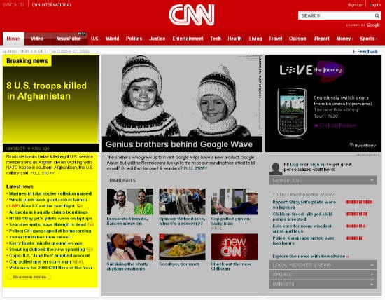
As you probably know by now, CNN launched a redesigned website yesterday. While I like the look and feel, the thing that really strikes me about the new homepage is how little of it is devoted to news. As you’ll see in the screen shot above, the far left column that I’ve highlighted in yellow is hard news while the rest of the page, which I have greyed out, is devoted to feature stories, ads and site features.
As a frequent visitor, it seems to me that CNN site has been shifting for awhile towards feature stories/ lifestyle news and away from hard news. With less than 1/3rd of the above the fold homepage devoted to national/world news, I think this new design is another big step in that direction.
Sign up today to have our latest posts delivered straight to your inbox.