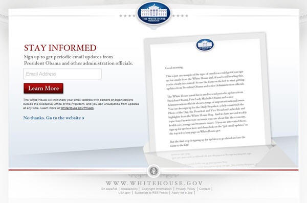
As most of you know, splash pages are those annoying introductory pages that ask you for your email address before letting you access the actual website you are trying to visit. Having worked in digital for ten years, I can make two definitive statements about splash pages:
When I consult with clients, we talk through whether the increased conversion rates brought about by splash pages are worth the problems they cause for users. Sometimes the answer is yes. Sometimes it is no. It really depends on the overriding mission of the website.
Yesterday I visited the White House website for the first time in awhile and was surprised to see an email splash page featuring President Obama. When I cleared my cookies and visited again today, I saw the version at the top of this post, indicating the White House is experimenting with different versions.
If this were the website for President Obama’s reelection campaign I wouldn’t think twice about it. Emails = donations, and donations are the fuel for all campaigns. Harvest away.
Perhaps I’m a hopeless optimist, but it seems to me that the White House website, which is paid for by taxpayers, should have a purpose higher than conversions. The number one priority of the White House site should be to inform. Putting up a splash page that will automatically drive away a large percentage of visitors seems counter to the spirit of the enterprise.
Mr. President, tear down this wall.
Sign up today to have our latest posts delivered straight to your inbox.