![]() So Hotsoup, the much hyped political social networking site, launched quietly a few days back. I hope for the sake of founders Mark McKinnon, Joe Lockhart Matthew Dowd and Carter Eskew that this is an alpha release or something because it is a mess.
So Hotsoup, the much hyped political social networking site, launched quietly a few days back. I hope for the sake of founders Mark McKinnon, Joe Lockhart Matthew Dowd and Carter Eskew that this is an alpha release or something because it is a mess.
I've been working in web development for ten years now and after wasting spending thirty minutes going through Hotsoup I still don't really understand what they are trying to accomplish here. The site just doesn't make a lot of sense.
Here are a few of the more glaring problems I saw:
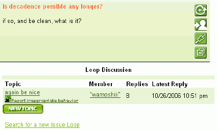
(1) The site is basically a glorified message board. From what I can tell, the idea is for users to create Issues Loops with their take on issues they care about. Other users then chime in and add thoughts through a discussion thread that feels like an old school message board. Here's a link to a loop on "liberal bias among colleghe professors."
Below is a screenshot showing what the discussion interface looks like:

After using social networking sites like MySpace and Facebook and participating in discussion on sites like Digg, this message board style interface just feels ancient.
(2) I guess the other big idea is to have big name guests drop by and interact with users through the Hot Issues section. Folks like Karen Hughes and American Idol judge Randy Jackson. But as far as I can tell, all these big names did was email in some recycled content. There is little evidence they spent any real time on the site themselves. In an age where people like Mark Cuban answer their own email, faking access to big names isn't going to cut it.

(3) Friends? We don't need no stinkin' friends. On MySpace, the friends feature is pretty much responsible for the massive growth of the site. Inexplicably, Hotsoup has a networking section that allows you to search for people's profiles, but there is no way I saw to create relationship with other users you like. It's a bafflling omission. I guess the idea is to be about issues and not people. Great soundbite. It's not going to work, but great soundbite.
(4) The site's design, user interface and technology feel ancient. This site is brand spanking new yet still feels like something from 2001. Video won't play in Firefox 2.0. The threaded approach to discussion requires tons of clicking and feels dated. They use frames in spots. It all feels very Web 1.0. Check out Vox and then go to Hotsoup and you'll see what I mean. Hotsoup just isn't even in the same league.
(5) The sign up form is super cumbersome. In an age when you can create a blog or join a social network with your name and email address, Hotsoup requires stuff like gender, party affiliation, birthday, full address, and more. I may be going out on a limb here, but I get the feeling that Hotsoup may be doing some microtargeting down the line. Nothing wrong with having a business model. But it's just too much for people like me who prefer to share as little data as possible and have the attention span of a gnat.
I think there is a market for social networking around politics. I just don't think Hotsoup has the right combination of features to make it work. I don't see any way Hotsoup will succeed unless dramatic changes are made. It is DOA.
Here are some other reviews:
Sign up today to have our latest posts delivered straight to your inbox.