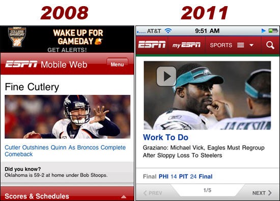
As a sports fan and iPhone user, one of the sites I frequently access on my phone is ESPN.com. ESPN recently launched a new mobile site for iPhones, which is more robust and app-like than just about any mobile site I’ve seen. As a reference point, below are screenshots of the ESPN mobile site in 2008 and today.

While they may not look that different superficially, the site today is much more sophisticated and user friendly than it was in 2008. It is all about the details:
ESPN has worked hard to create a thoughtful mobile experience that focuses on getting users to the content they need without any tension. For me, the simplicity and focus on content of the ESPN mobile site is a not reprieve from the clutter that you find on ESPN.com and other news sites.
Sign up today to have our latest posts delivered straight to your inbox.