Like all things that become popular and overused, there is a backlash against the once revered single page, long-scrolling bootstrap template website. It is safe to say that a good percentage of the design community is eager to bid it farewell. While I am as bored as my counterparts with the army of single page sites that all look pretty much exactly the same, I’m not as quick to dismiss the entire concept as passé.
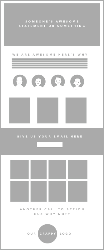
 From a design point of view, the concern is the saturation of bootstrap style layouts for every agency, PR shop and freelancer needing an easy template. A design can lose its impact if visitors have seen it a million times already. Hero image, intro statement, services icons and links, news and blog, CTA and footer. Mix and match if you wanted but most take the template straight out of the box and call it a day. It is bought, used and copied because it works. A one-person shop can produce work as polished as a a lot of decent-sized agencies.
The single-page layout can still work well, however, if you approach your single page website as a completely fresh design build. The fact that the page can be simple to lay out doesn’t mean it should be considered a template. If anything, with the abundance of single-page scrolling sites, designers need to give more care in creating original designs within this framework.
The reasons a long scroller still gets plenty of play here at the Brick Factory are:
Immediacy. A single page scroll eliminates confusion as the user interface (UI) is immediately understandable.
Mobile. Obviously, a single, long page scales to mobile fairly easily. I don’t have to spend time developing custom layouts for different phontes, tablets, widescreens, etc. This cuts down design time and results in sites that work well on all devices.
Parallax Scrolling is still kind of cool. If you have professional photography, single page sites can still look remarkable.
Scroll-activated animations and transitions. These events can work within a variety of layouts, but we find they work best on a vertical scroll and can become a meaningful component of the narrative.
Maps, Graphics, etc. Integration of graphical elements presents less of a design challenge when you have the luxury of a blank canvas to work with.
Less distraction. For some sites we build, a singular narrative is preferred. This is particularly true for focused sites that have one overall message to convey or call-to-action to complete. A long scrolling site is perfect because it allows for a distraction-free user experience.
Modules. If you design systems rather than pages (cough, like we do, cough), then a single, deep site works perfectly and can be reworked easily through rounds of internal and client edits. Components can easily be moved around and reused.
In summary, although a bit labor-intensive on the front end, if designed with a creative approach one-page scrolling sites can still work. A conscious effort to create a unique design that doesn’t look like every other site on the Internet just needs to be made. If you do that, the single page site can provide a friendly, consistent experience for virtually all levels of user on just about any device.
Sign up today to have our latest posts delivered straight to your inbox.