Details matter online. Every aspect of your web program is an opportunity to communicate who you are to your visitors.
On most websites many small opportunities to connect are squandered. A great deal of energy is put into big, obvious decisions. I’ve been part of two hour discussions about what image to use on a site homepage, for example. Zero thought is given to the small details of a site that can do just as much to convey your brand identity.
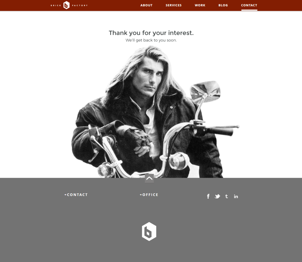
Take the thank you message a user sees after filling out a contact form, for example. On most sites you are shown a generic thank you message, seemingly written by a robot. This opportunity to communicate is thrown away.
When redesigning our contact form for www.thebrickfcactory.com, we wanted our thank you page to surprise people and show our sense of humor. We wanted it to convey a bit about who we are. So this is our new thank you page.

The picture you use on your homepage is important. But don’t focus so much energy on those big decisions that you miss other, smaller opportunities to communicate your brand.
Sign up today to have our latest posts delivered straight to your inbox.