We’ve heard a lot so far about the 2008 presidential sites focused on Web features and content. What we haven’t really discussed yet is the look and feel of these sites. So here’s my take on the 2008 presidential sites…from a designer’s perspective.
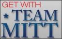 |
Mitt Romney, The Exploratory Committee 2008. Wow. Sounds impressive. Then in an even bigger font than that title I see “Get with Team Mitt” and I wonder what Mitt is implying. Team Romney would have worked better here. Mitt isn’t a name for a human. I had a dog named Mitt. He ate a can of Schlitz. The actual can. |
 |
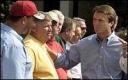
Tommy 2008 – Huh? The pants? The Hilfiger guy who makes the pants? Oh, Tommy G. Thompson, former Governor of Wisconsin. Here’s my issue with the governor: When you hit 9, your mom switches your name from Tommy to Tom. Like mine did. The site could also be brightened up just a touch, Tommy. |
 |
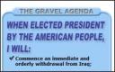
Brownback For President – And he means it. Look! The White house is right there, top center near his name, before his own picture (where he uses the White house as a backdrop). Bold move, Senator. Also, most ridiculous use of the American flag so far. |
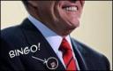 |
Join Rudy 2008 – The title of his site is also an instruction to me! That’s time-saving! Simple design. No vertical scrolling. Not too bad, really. The American flag pin reminds us that he’s an American. |
 |
John McCain 2008, The Exploratory Committee – Black and white color scheme means he’s serious. Interesting metaphor, actually. I wonder if it’s intentional? Design is solid and about section contains a concise bio. Not too shabby. |
 |
U.S. Senator Barack Obama, Presidential Exploratory Committee – What’s left to say? This site has been poured over almost as much as… |
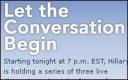 |
Hillary for President – I love the over-the-top tagline…”Let the Conversation Begin”. You almost wince as you read it. Still, she has the best overall design, as usual. Plenty of opportunities/actions to choose from without overwhelming users. |
 |
John Edwards ’08 – He went with a splash page in order to capture your email before you even enter the site. Curious. Or brilliant. Or neither. |
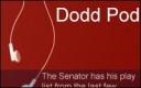 |
Chris Dodd for President – Decent design is flattened by DODD SQUAD logo (wincing here), and the Dodd Pod (wincing so hard now) playlist. |
 |
Mike Gravel for President 2008 – Well, look at you with your Photoshopped little bevels and Gaussian blurs and things. This design gets a B. If this were 1992. |
 |
Kucinich for President – This is a wild ride. The top 100 pixels of the site (some pretty valuable real estate) is just a weird flash animation that rolls slowly through some inspiring terms like “action” and “insight”. To be honest though, it does pull my attention away from the poorly laid-out content below. |
And the winner is:
Hillary, Edwards and McCain are well designed sites. Obama is fine, but a little heavy on the video. My personal favorite is Chris Dodd. He and I both enjoy Night Ranger. Go ahead, check his Dodd Pod.
Sign up today to have our latest posts delivered straight to your inbox.