Part one of my review of the top presidential campaign sites starts with Hillary Clinton's (exploratory committee) site .
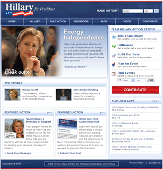
As I've mentioned in a past post, this site impresses me with its lack of fluff and solid design. The red, white and blue palette is toned down for a less giddy experience. The user's eye doesn't bounce around. It goes where it was intended to go: the logo to the video to the action center. It's also only as Web 2.0 as it has to be. The background and internal use of the gradient when applied judiciously is one of the appealing aspects of the 2.0 design mantra and works just fine here. No reflecting pool logos (author guilty as charged) are to be seen. The text contrast has been subdued for maximum readability. No high contrast or color/font choices to vibrate through. The Contribute button, although in stop-sign red, is placed between the Action Center and Featured Clips, halfway down the page. Not exactly screaming at users, which is a nice change of pace. You don't see it repeated in the milder universal navigation until you're already working through the site. The overall initial experience is refreshingly pleasant here and I am into the content quickly without having to click through any registrations or toil through a video or splash page. High marks.
Click on the screenshot below and then roll over the numbers on the various page elements to see comments.
Sign up today to have our latest posts delivered straight to your inbox.