When I was 7, my father finally broke down and bought our first color TV and I wouldn’t stop screaming for days, I’m told. Well, that feeling was nothing compared to the crazy joy we all felt over here when the McCain for President web team presented us with a new colorized version of their campaign site yesterday. To be honest, though, when Edwards spiced his site up, I sprained both wrists from all the high-fives.
This latest version of the campaign site seems only a bit forced to me. If I had gotten as much criticism for the black and white scheme as the designers originally did, I might have used this opportunity to throw some color in as well. With that being said, let’s take a look and see how we did.
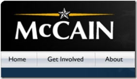
The structure of the site is more traditionally laid out and in the header, a circus-style banner is revealed to proclaim The Announcement is coming today. So, immediately the tone of the user experience is changed to produce some excitement, where we last had nothing but grave statements and ghosted stars and stripes. The header was so militaristic, in fact, with the black and white flag and the Silver Star McCain logo (now in color!) that the added old school banner gives it a WWII feel. Maybe this is intentionally nostalgic but probably not.
Below is a lot of new content and all of it in full color. The generous real estate used for the campaign announcement looks good here and the photo used is upbeat rather than overly serious. A gigantic blue button begs me to Read The Speech, which I respectfully decline. Below all of that swagger is another chance to read the speech, an opportunity to donate and some supporting articles from the day, including (did you read ahead?) a link to read the speech. The Get Involved section is the same standard fare as before, and is of course numbered for my convenience. The middle third of the home page is Straight Talk Express-centric. A slick video full of sound bites reminds us that the bus is coming, and to the right of this is a well enough designed, side-scrolling calendar of bus events. A quick click on the modest “more” button takes me to the Straight Talk Express page (a web 2.0 overdose of shiny floor reflections and Photoshop filters). Below this is a poll about water-free urinals, congress and the World Toilet Summit and some mostly regurgitated filler content.
So, perhaps we can assume that the McCain team kept the site in black and white until he officially announced. I think they’d like that, so let’s. What the hell?
This is an improvement over the initial launch of course and the black and white gripes will finally come to an end. It was a weird couple of months though, and I wonder if the branding took hold a little stronger than anticipated.
Sign up today to have our latest posts delivered straight to your inbox.