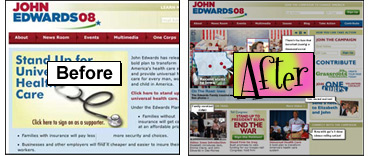
Click on the left image to see the before and the right to see the after.
Sounds like a stirring movie, but it isn’t, thank God. It’s the title of my design review of John Edwards campaign site update. I was puzzled by the lack of Edward’s face on the last version of this site, and I thought the overall tone was rather grim. Not John McCain grim, but pretty sullen. Since that initial launch, Edwards has gotten a lot of publicity that really has nothing to do with his campaign. The Ann Coulter weirdness and the announcement of his wife’s medical condition took center stage. Upon viewing his site last week, I was pleasantly surprised to see a much more inviting and energetic offering from his camp.
I still have to shoot past that splash page, but only once and I’m going to let that one go since clearly he isn’t. In the main site what was once a duotone wall of healthcare opinions and stats is now a vibrant interface that is only mildly annoying. The main real estate on the page is taken up with a huge scrolling image of: John at a rally, John at a rally again, Global Warming Action Month, a shot of John appearing to preach in a field perhaps and John with Elizabeth saying thanks for the support and concern. Then a few more flags and rallies and a big Stop The War message. Okay, no one but me will have gone through them all, but they’re a big improvement over the static message from the last design effort.
The Action Items (yeah, I said it) are now much easier to get through. The last version held them in tedious fields of solid red and blue, and along with the stagnant nature of the page, they were passed over pretty quickly. The new version just does it better. The colors are brighter, no elements are reversed out, and Spread The Word has been replaced with a Grassroots invite that at least seems more interesting. Not interesting enough for me to click on, but I’m a worst-case scenario.
Below all of this are included more images to break up the content of the page and a link to send John and Elizabeth a note. It’s a nice touch and even I click through. The thank you note that starts the page is elegantly written and thankfully the picture of John lightens the mood as he is orange here for some reason.
Overall the redesign of the site, mild though it is, really works in my opinion and the site is now on par with the better presidential campaign sites.
Sign up today to have our latest posts delivered straight to your inbox.