Barack Obama’s team has redesigned his website just prior to the Iowa Caucus and, well, I hope you like the color blue. I do.
I also think this redesign puts his web design effort at the top of the heap.
Starting at the top…
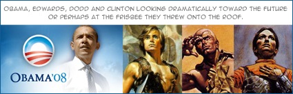
The over the top photoshopping of the clouds and lens flare as a background is so dramatically piled-on that you have to give the designers a lot of credit for even submitting it. The fact that it works is a testament to not only the designers but also whoever approved this thing. An extra cloud here, a ray of sunshine there and this effort is a parody. The photo used of the candidate is also pretty gutsy, with him staring into the future or whatever, but again in this new setting works just fine for me. The tone of the site now is one of confidence. No blaring headlines or screaming calls to action. Even the illustration used to announce his victory in Iowa is tasteful.
Barrack himself is notably absent from the body of the site. His photo is in the header, there’s a cropped shot of him halfway down the page and that’s it. Compare that with the last version of this site or some of the current crop and it becomes obvious that the designers correctly assume that we know who this guy is by now.
I believe the strength of this design lies mainly in what is not there. There is no evidence of micro-management here. The car ad mentality you so often see of developing all available white space is absent. The icons are small, beautifully rendered and expertly applied. Rather than the monochromatic scheme walling us off from the content, the designers have made the experience more inviting than it was before. All of the major campaign sites are at a very professional level at this stage but the Obama site has now taken the lead with a decidedly more artistic and elegant approach.
One little glitch…
When I scroll to the bottom to find the credits for the site design, I am saddened to be met with – POWERED BY HOPE AND SUPPORTERS LIKE YOU, which makes me:
a) Cringe,
b) Feel bad for the design team, and
Wish he would consider reeling back in the Hope metaphor once in a while.
Sign up today to have our latest posts delivered straight to your inbox.