As a required companion piece to this post, I have grudgingly crafted a review of the 5 sites that are on the lower end of the design scale. Some of these campaigns have no budget, and others are just a few years behind the times. Some others are just lazy. Although none require any real commentary, I need to take up some space on this blog and I think you’ll agree that I’ve done just that.
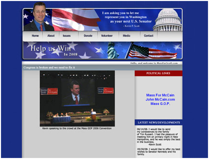
“Congress is broken and we need to fix it”, states Kevin Scott. At least it says that on his campaign site. This is where I might make a broken site joke, high five Todd and call it a day. But I’d rather focus on the awesome stars and stripes bastardization and glimmering flash treatment that Team Scott chose to waste time on rather than put some actual content on this little gem.

Interesting. The navigation, by way of some type of…special effects-eye-trickery, appear to be actual three-dimensional buttons, that I can…wait. Oh, it really is just trickery. Well-played, Senatorial hopeful Cina. You’ve won this round.
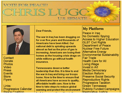
Chris Lugo’s site is named voteforpeace, and his message is reinforced powerfully with the addition of a giant mutant peace flower that defies biology with its star-laiden center. All kidding aside, this is the weirdest Senate campaign site I’ve ever seen and as such is my new homepage.

What the hell happened here? My eye goes directly to Senator Kerry in his hot-pants. I know that wasn’t intended. There is content on the page, but it looks so uninspired. On the plus side, the sub levels are much better than this page. John J. Cina runs excited circles around this page. Then politely sits back down.

The flag on top actually waves (or pulsates, rather), the navigation arrows spin wildly on mouse-over, and the garish red fields inspire fear. It’s everything I look for in a campaign website, really, but just then I’m bowled over by…a digital, lifelike Vernon Jones entering stage right to help me through the process. He’s pretty smooth, and the implementation is well-done, but it’s just an unnecessary addition to a rather overblown, goofy effort.
Well, there they are in no particular order. Just 5 examples of perfectly good urls that went to waste.
Sign up today to have our latest posts delivered straight to your inbox.