In putting together the report we released last week, The Use of the Internet by 2008 Senate Campaigns, my co-workers took the time to identify the websites of everyone running for the Senate this year. Since my co-workers already did the hard part in finding the sites, I figured I’d cruise through the list and pick out my most and least favorites from a design perspective. Presented below are the best designed homepages of the group, in my opinion. I’ll write up the worst later in the week.
There is no shame in coming in 5th place. My father said that to me after a disappointing 11th place finish in the Pinewood Derby.
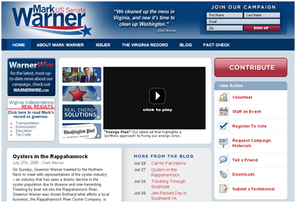
Although there is a hint of Obama-borrowing here, I liked this site for its generous use of white space and logical placement of content/actions. The splash page sign-up is of course a real slap in the face but at least the skip through link is not hidden. My eye goes directly from the (only mildly annoying) logo to the contribute option to the actions. Everything on this homepage is easy to instantly recognize and quick to find (and then dismiss in my case).
To come in 4th place is to be a medal winner if one the top three is found to be juicing.

The Rick Noriega site is a solidly-designed effort that grew on me after I got past the turtle popping his head out of the shell portrait on the right. It’s weird and 3-D but at least he’s not staring at me. My eye (twitched, then) went directly to the 3 boldly displayed actions below his image. They are the most prominent graphics on the homepage and it makes sense to boil down the actions to just these three solicitations. I also like the general style of this site and the Texas star as design element. Goofy? Maybe, but no American flag in the huge horizontal blue field up top wins points.
3rd place just feels good, doesn’t it? Comfortable, without the pressure of being considered the best by anyone, really.
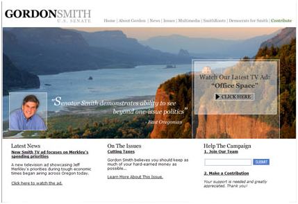
There is a certain confidence in this design that allows it to look more like a Conde Nast magazine cover than a campaign website. Consider that the photography alone appears to have cost more than a lot of the other candidates’ sites entire budget. One latest news item. One Issue. The contribute button had to actually be searched out. No flags. No stars. Images of Oregon are the stars of this show with Senator Gordon Smith as your very understated MC. How the designers got this one past the goalie, I’ll never understand.
2nd Place. Is there really a sadder finish than 2nd place? Yes there is. 3rd, 4th and 5th.

Al Franken’s site provides nothing new in terms of functionality or grassroots tools as far as I can tell. Why this site rates so highly is the execution and the site’s tone. This site is going for homey and actually pulls it off. The wood panel background? That just shouldn’t work, but because it is so toned down you almost don’t notice it. The palette used is unique for a political site and the layout is a tidy 1200 pixel or so vertical scroll that feels about right. Also of note is the lack of a stop sign red contribute button. It might seem like an insignificant touch, but consider this as an alternative.
Sound the horns. Release the pigeons. Kleeb wins!
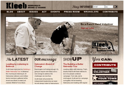
Yes, Kleeb is actually a man’s name. Scott Kleeb, and he’s Nebraska’s Brand of Change! Alright, grammatically, that might be a little awkward, but stay with me and embrace the brilliance of this sepia-toned little beauty. Besides being totally different (at first glance) from all the other offerings, the designers spent a little time and money on image. Considering carefully the audience, this effort seems perfectly stylized to me, from the monotone palette to the spot-on photography. “Be a ranch hand volunteer”. Are you kidding me? That shot of the cowboy guy on the windmill? Come on. The logo is a cattle brand! This entire site design was risky and easily could have gone down the cringy path, but good principles keep it well above the fray. The information that is worth reading is well-placed and mostly above the fold, and the calls to action are bold and easily found. I think the page finishes well with the act | meet | more navigation organization as well. I’m in and out of this page quickly and onto whatever it is people actually do on campaign sites.
Tomorrow: The Losers.
Note: We do some political work, but did not consider sites we worked on in putting together this list.
Sign up today to have our latest posts delivered straight to your inbox.