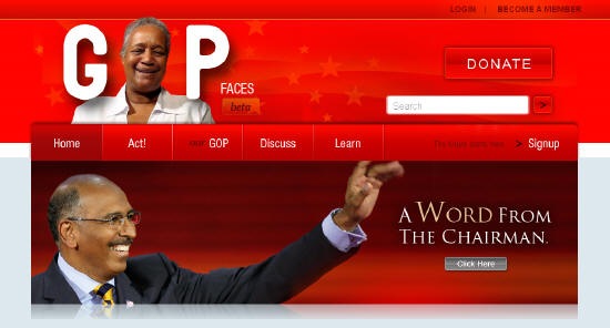
I’m not breaking any news here by telling you that the Republican National Committee launched a significant site redesign yesterday. After spending some time going through it, I have mixed feelings about the new site. While I admire the boldness of what they are trying to do, I think in an effort to develop a strong online brand the GOP messed up some of the basics. I also know that the best sites improve in an iterative nature over time, so I suspect many of the problems I see will be addressed in the coming months. With that, following is the good, the bad, and the ugly of the redesign.
The Good
(1) While some have criticized the feature, I like having the faces of the people that make up the GOP worked into the logo at the top of the page. It is a nice branding touch and helps humanize the Party. I wish I could click to get more information about the person featured, and why they support the GOP, however.
(2) I like both the Heroes and Faces sections. Once again, good branding I think.
(3) It is clear that some really talented designers worked on the project. While they clearly spent some time on the Obama site, some of the design detail work is really well done, and appreciated (example below).

(4) The site allows users to login via Open ID and Facebook, meaning you don’t have to create an account on the site to participate. That is great.

(5) It doesn’t look like any campaign site I’ve seen before, and given where the GOP is at, I think that is a good thing.
The Bad
(1) The site is blog heavy, prominently featuring nine different blogs in the Discuss tab in the main navigation menu. While I appreciate the blog-based approach, the titles of many of the blogs are unclear (Sound Reasoning, Stomping Grounds, Say It Loud, etc.), meaning there is no easy way for me to figure out which I’m interested in besides diving in and trying to read them all. There is also no place on the site that I see where I can actually read ALL of the blog content in one spot. The end result of confusing, and I think will be a roadblock in any of them gaining a significant readership. I would build a page quickly that aggregates all the blogs in one spot so people can more easily pick and choose what they want to read.
(2) The main call for users to sign up for email updates is hidden behind a click. While I appreciate this as a user who is already on their list, as someone who builds sites for a living I would never want a user to have to click more than once to give me their email. I’m a firmly believer in making the sign up process as simple as possible.

(3) Frankly, the homepage doesn’t contain a lot of content and features a lot of open space. The homepage focuses almost exclusively on branding, and very little on the dissemination of information. Given all the content the RNC produces, I think long term the homepage will need to become more dynamic so the RNC can use it to actually highlight what they are doing. I would expect the balance between branding/news/action to evolve a bit in the coming months.
(4) Along similar lines, I really don’t think the RNC needs to feature a Facebook/YouTube/Twitter/Flickr widget so prominently on its homepage. I don’t get why you’d want to devote all the space to promoting your presence on Facebook when you have just launched a huge social network on your own site? Why not highlight some activity from Our GOP as a way of encouraging visitors to join?
(5) This is entirely a personal preference, but the site is really red and I’m not a big fan of red on the web. I understand that the RNC is trying to do for red what the Obama site did for blue, but for me personally it is just too much.
The Ugly
(1) On launch day, the site suffered some down time and a variety of other technical problems which were catalogued gleefully by the press and critics. While it marred launch date, these problems will be forgotten very quickly.
(2) When the site launched, Chairman Steele’s blog was called “What Up.” After the name was met with ridicule, the RNC renamed the blog “Change the Game.” I’ll just say that I think the new name is a pretty dramatic improvement.
What do you think of the new site?
Update: Wes Donahue has a good review of the new RNC site. He mentions one thing that I forgot to include in the Ugly section – Mini Michael. When you first go to the site a virtual Michael Steele walks across the site to do an intro, like Mitt Romney’s site did back in the day. Not a fan.
Sign up today to have our latest posts delivered straight to your inbox.