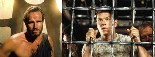
Re-imagined is a term usually reserved for remakes of curious 1960’s movies and second acts of flamboyantly-colored Dodge automobiles. Re-imagined is a histrionic way of asking us to give something a second pass. Tim Burton’s Planet of the Apes was re-imagined with a bewildered Mark Wahlberg in place of Charlton Heston and the result was a very long first date for me that turned out very badly indeed. Dodge re-imagined their Charger as a heavy, brutish road predator that the police now use exclusively, it appears, to harass yours truly for excessive speed (court dates pending).

USATODAY.com has alerted us to their redesign with a slog of banners and videos and social networking efforts containing the buzz-word reimagine, which according to my spell check, isn’t a word. I don’t concern myself with that any more than might I watch a video explaining a website redesign to me. Let’s just dive in, rather, and see what all the ruckus is about.

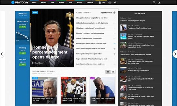
I have entered the site, moving quickly past the new logo (which may require some discussion as well) in default view (versus cover view) and the initial pass is pretty impressive. I’m used to the big picture/story, top-heavy layout for a news site and I think that style makes sense, but I think this new idea might work out just fine. The big story, in this case Mitt Romney’s head, is high and tight and yet still unobtrusive because I have an additional 10 (and with a click, 20) headlines at eye level as well. There are a lot of choices above the fold and new visitors may find this experience a bit like fighting through a low end diner menu, but I’m willing to put up with stock info, unending layout options and other goofy add-ons to get through the experience (and this required blog post).
You can customize your experience here at USA Today. I get that.

One of the options I might actually use is the cover view tab that allows for that top heavy view I’m used to. The photography is outstanding, as expected, and for certain stories the photography would be the draw. Below the fold are Today’s Lead Stories, presented either visually in a grid or as more traditional headlines. Right Now is a rather urgent title of the more frequently updated content that runs the entire sidebar. The bottom of a page is a truest test of a complete web design, I think, and USAToday.com finishes off their effort pretty well. Besides unobtrusive and attractive icons for feedback, applications, staff index, etc., the site index link brings up a full footer that completes the page design beautifully and usefully.

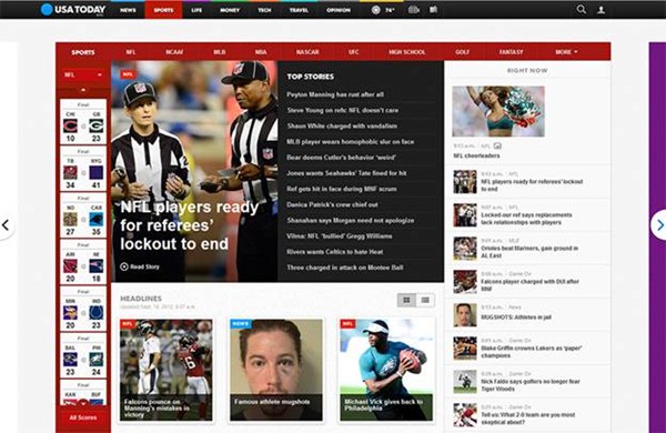
The sub levels are not in any way watered down designs of the home, but content-packed homepages themselves. There is no real hierarchy in the site. Part of what makes this redesign attractive to me is the amount of real content on every page above the fold. Deep vertical scrolling has been acceptable in news sites for a while and will continue to be but having as much new content where I can see it immediately has been done with great care on this site and never overwhelms the user.
USA Today never capitalized on what their paper’s core strengths were, in my opinion, but I feel like they have taken a significant step here. This is a big news site now and a good upgrade for the online news experience. For USA Today, it’s huge and positions them at or near the top of the current crop news site designs.
Sign up today to have our latest posts delivered straight to your inbox.