You don’t have to go home, but you can’t stay here.
We’re finally in the home stretch of the 2012 Presidential election and like a Chili’s at last call, it’s all about some action now. The lights are on and Smilin’ Joe Biden is looking less debonair than he was a few hours and drinks ago, but it’s time to fish or cut bait. The two candidates’ sites are similarly stacked with opportunities at this late stage to pitch in and help with the final push (while seeming to give the appropriate amount of real estate to the Hurricane Sandy relief effort). I haven’t taken a fresh look at the Obama and Romney efforts in a while because I feel like I’ve perhaps been getting just enough of their giant heads on tv lately. That changes today as I bravely pull screen grabs of the sites and make comments on the successes, failures and oddities (Biden inexplicably wearing someone’s shades for the glamour shot/ Ryan nowhere to be found).
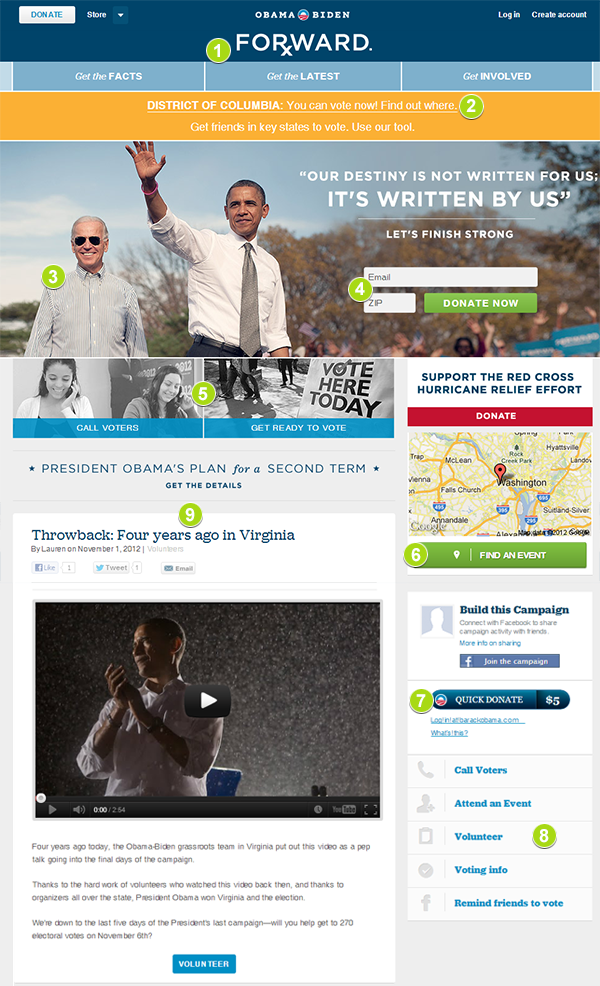
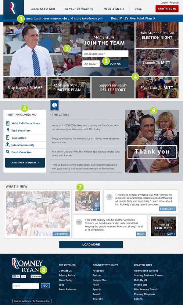
To state the obvious, the numbers on the site screenshots correspond to the comments below.
BARACKOBAMA.com

- FORxWARD. I’m not sure how long this cutesy tagline edit has been up, but I see what you did there. I’m surprised that this element has been placed as the heading of the site. Healthcare wasn’t a prominent part of any recent discussion or even a highlight of any of the three debates but it gets the star treatment now.
- Smartly positioned and localized call to vote early.
- Puzzling image of VP Biden looking as if he left his bomber jacket in the limo. It might be me, but Joe looks like a South Park character in this photo.
- Donating at this stage seems belated, but these ads need to keep running through Tuesday night, sadly.
- Call Voters prompt. She wouldn’t be making that face if she called me.
- Under (and part of) the Hurricane Relief banner I am asked to Find An Event, which is intriguing because I’m unclear what kind of a volunteer opportunity to help victims I might be able to…oh. Find a campaign event. Nothing to do with the hurricane. Huh.
- Quick Donate! I don’t know this strategy, but I like it. A quick hit 5 dollar donation aimed at young people so they can feel that they are part of the movement. I would like it better ( and it would be funnier) if they placed a comma after Quick.
- The old Action Items are now pushed down the page a bit to allow for those same actions to be highlighted in a slightly different and louder way above the fold. This tactic is used by everyone in politics because it always works.
- The President shown prior to his victory 4 years ago brings a positive feel to the dull lower half of the homepage.
MITTROMNEY.com

- Where Obama went with Rx in the header as the campaign’s final tagline, Romney’s team pushes more jobs and take-home pay.
- The deliberate absence of Paul Ryan is curious here.
- Joining the team at this late stage might seem pointless, but emails with more volunteer opportunities will go out immediately.
- Mitt is surrounded here like Custer. Action Items everywhere you look. You have to assume (if you’re cynical like me) the placement of the Red Cross banner was agonized over for maximum effect.
- Again, some of the original Action Items are repeated directly below the newly designed versions.
- To me this looks like a an image reserved for the after party website.
- A variation on the Obama positive vibe layout with a choice to load more of this content if that was something I felt was needed. I don’t.
- The only mention of Paul Ryan that I can find on this homepage.
I think the most interesting aspect to the stretch runs of these campaign sites is how incredibly similar the strategies are. Down to controlling the order in which your eyes scan these pages, both camps are careful not to swing too far out of what is tried and true. On the plus side (for me, at least) there’s a sweaty, smiling desperation to the sites that even the best photographers and copywriters can’t hide. Except for the delirious and perplexing confidence of Joe Biden’s Top Gun photo, the swagger of the debates is now replaced with focus group tested methodologies and old school panic.

