All consulting companies struggle to find the right balance between doing work for clients and doing work for themselves. When you are fully booked with paid projects, it is difficult to find the time to update your own blog, redesign your own website, etc.
For me, the other challenge is that I have always found it easier to do work for other people than for myself. On client projects, I’m pretty decisive and rational. When working on Brick Factory stuff I tend to agonize over decisions, struggle with writing copy, and generally let the perfect be the enemy of the good.
So in mid-2023, we found ourselves with a Brick Factory website that was probably a good year past its shelf life, with no real path forward. We finally buckled down, made a plan, and got started.
Assuming the creek don’t rise, we will launch our new site in mid-February. Below is a summary of our main objectives with the redesign, along with a few preview screenshots. We hope you like it!
Our website is primarily focused on reaching prospective clients looking to hire a digital agency. There are three types of projects we are primarily contacted about:
We updated the language on our website to speak directly to prospects looking for these kinds of services and to make it dead simple for them to reach out if they are interested.
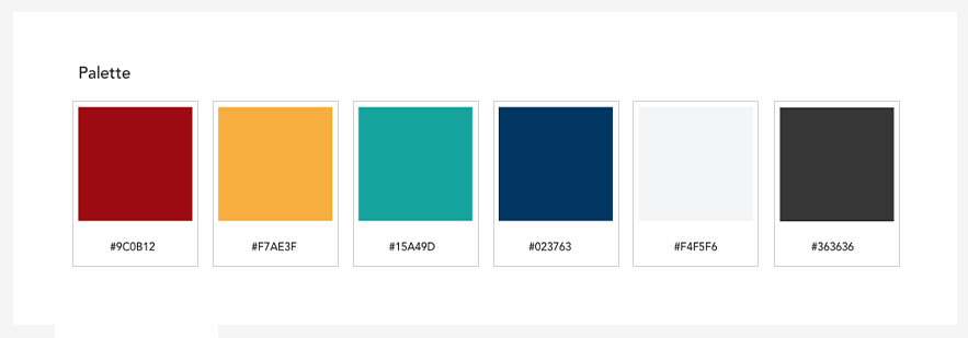
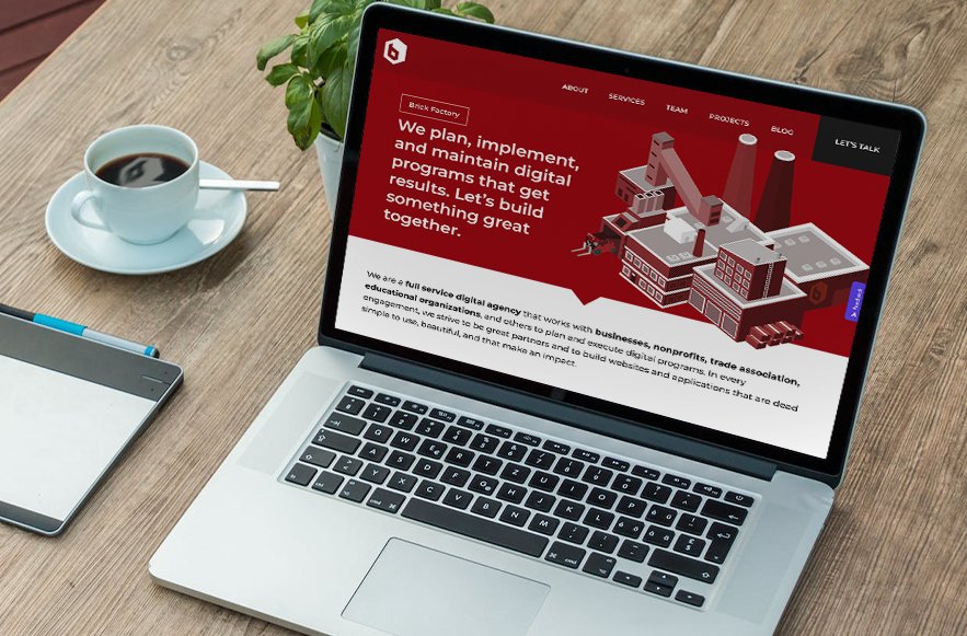
Our name is Brick Factory and when our logo was developed in 2011 we went with a maroon color scheme to reinforce the “brick” theme. I made this decision despite not really liking the color red. 🙂
Since then we have felt a bit boxed in by our palette. We have created a lot of monochromatic designs using just the brick color with greys and whites. After a while, it has all started to feel a bit drab, so when redesigning the site we wanted to experiment with additional colors.
We spent some time with the color wheel and introduced some secondary colors that we use judicially throughout the new site.
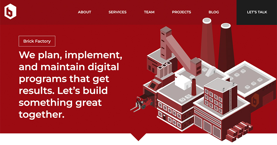
Ever since we launched, having a factory illustration on our homepage has been part of our brand. While we all work remotely from desks with computers, what we do is hard work. Being successful online involves showing up every day and grinding away. So I love the factory metaphor and wanted to keep it.
We came up with an updated version of our factory illustration that I think works really well.
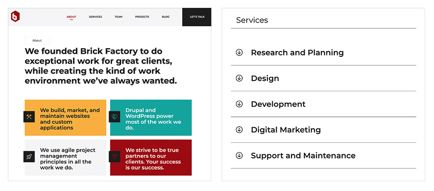
While you would think we would know better, our previous website featured a lot of large chunks of text that required a commitment from the user to get through. We know that online users tend to scan content for items of interest instead of reading from top to bottom.
We rewrote the website to include more pull quotes, factoids, and elements that can be opened/closed. The content is now much easier for impatient website visitors to get through.
Our previous site felt a bit cold and didn’t show a lot of personality. We wanted the new site to better show who we are and what it is like to work with us. We did this by adding behind-the-scenes team photos, including quotes from our clients, and providing more content about our philosophy and culture.

For many of our client projects, the vast majority of traffic comes from mobile devices. That is not the case for the Brick Factory website – around 80% is from desktop. It makes sense. Most organizations looking for a digital partner will do so during work hours from a desktop or laptop computer as opposed to a mobile device.
So while we always try to create a great mobile experience, we definitely started our design process with desktop/laptop users in mind.
We specialize in building websites in Drupal and WordPress. While the calculus is complicated and often based on the client’s preference, we typically use WordPress for simpler websites and Drupal for projects that require more customization.
Our previous website was built in Drupal. Since this was a complete start-over, we decided to rebuild in WordPress given how basic our site is. This allowed us to develop quickly and utilize the Gutenberg block system, which is our default tool for building sites in WordPress.
Sign up today to have our latest posts delivered straight to your inbox.