Over the years we have done a few posts highlighting exceptional college websites. The best college sites are pretty phenomenal, so we like to put these lists together as a way of finding inspiration. With the rise of mobile and widescreen monitors the last few years, we thought it was a good time to take a fresh look.
So without further ado, here are the 10 best college websites as judged by our Brick Factory team. Please note that we only looked at websites in the top 100 of the Forbes and US News and World Reports lists of best colleges, so around 150 sites in total. I’m positive there are schools that aren’t on these lists that have equally great websites.
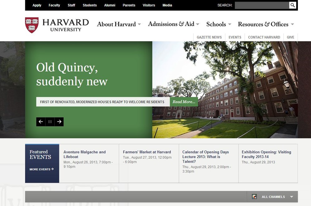
The Harvard site is really elegant and doesn’t try to do too much. I liked the Pinterest inspired headlines in the bottom part of the homepage.
A solid, usable effort from Virginia Tech. I would have liked to see them go bigger with the initial site imagery given that the site is fully responsive.

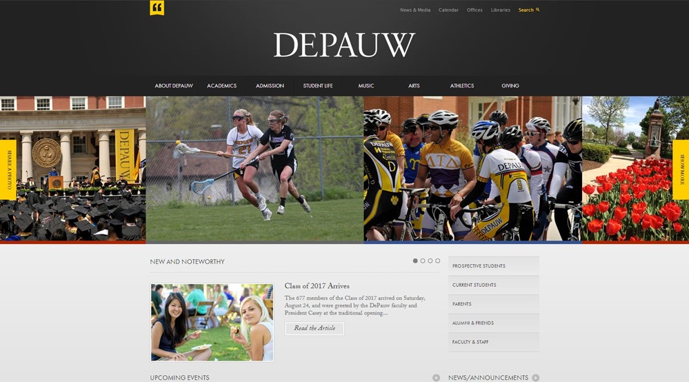
I love the grey palette with the splashes of yellow and the photo gallery strip that serves as the site’s initial visual impression.
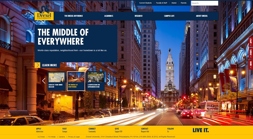
I love the bold imagery and the use of responsive design. Also liked the decision to buck the trend towards lots of scrolling on the homepage.
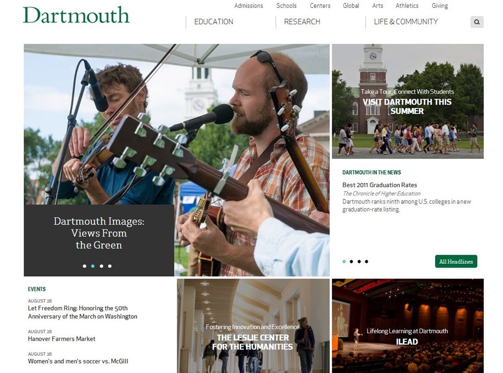
Dartmouth Pinterest-inspired homepage is simple and unique.
Another site that really uses photography well and which has a great palette.
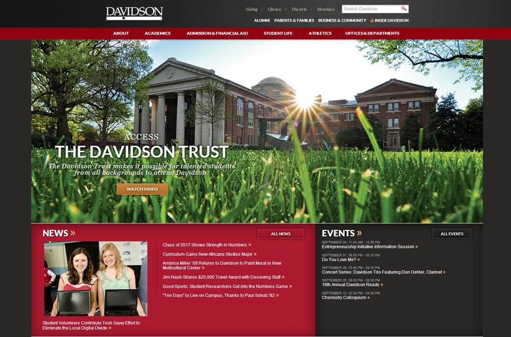
Great use of photography and parallax scrolling.
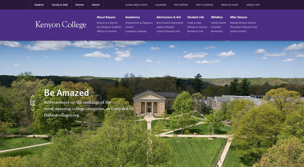
Good use of mega menu style navigation and the design on the bottom part of the homepage really encourages exploration.

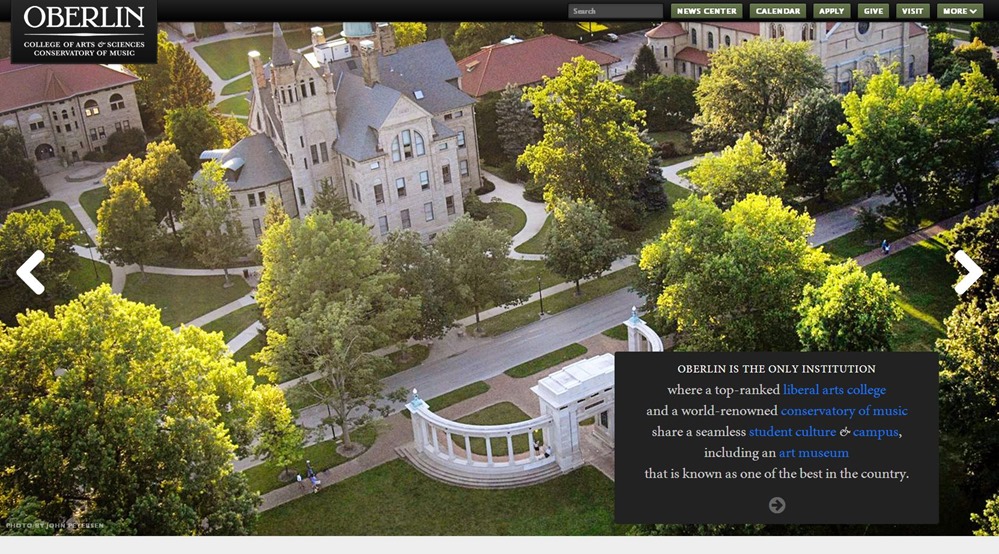
My personal favorite. In addition to fabulous photography, I love the headline collage and infographics that appear as you scroll down the homepage.
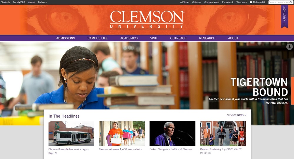
The Clemson site has an awesome menu system. The tiger eyes featured subtly in the header is a terrific touch as well.
In addition to these sites, I’d also encourage you to check out Middlebury College, Colorado College and Vassar College. These schools were in contention but didn’t quite make the list.
What are your favorite college websites?
Update: If you enjoyed this post you might also check out our post on the use of responsive design by colleges.
Sign up today to have our latest posts delivered straight to your inbox.