We are in the process of redesigning our Brick Factory website. It has been slow going. Client work competes for resources and we tend to over think everything when doing work for ourselves. But we are getting there, and expect to launch our new site before the end of the year.
As we planned the redesign I took a look at the websites of design and development firms from around the world. It was inspiring. Lots of firms have taken the time to create unique and beautiful websites. Browse through some of them here.
However, as I did my research one thing that struck was the sameness of many of them. In particular, I was bothered by the use of client work as the primary company branding. Let me explain.
Design Firm X will have a client that has awesome photographic resources – say a company that builds motorcycles. So when I visit the homepage of Design Firm X, I’ll see giant, sexy, professionally-taken photos of people riding awesome motorcycles. And that is pretty much it. The portfolio is the brand.
While sites that take this approach often look great and are likely effective, it sort of bothers me. It feels like cheating. Your site is one of the few chances you have to do whatever you want. Make your own brand, and don’t just showcase the brands you’ve helped create for your clients. Take your own photos. Create your own art. Write your own copy.
Make it about you. Tell me your story.
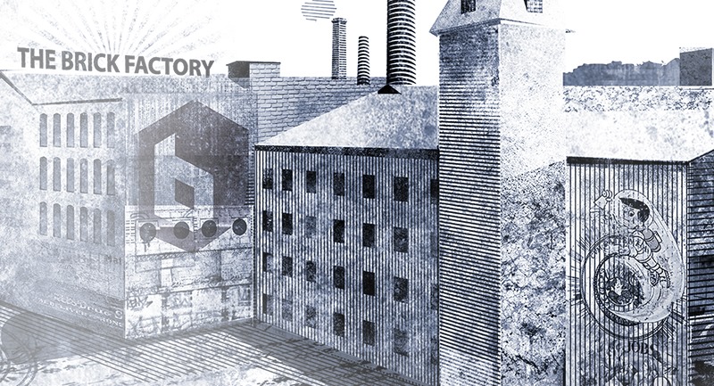
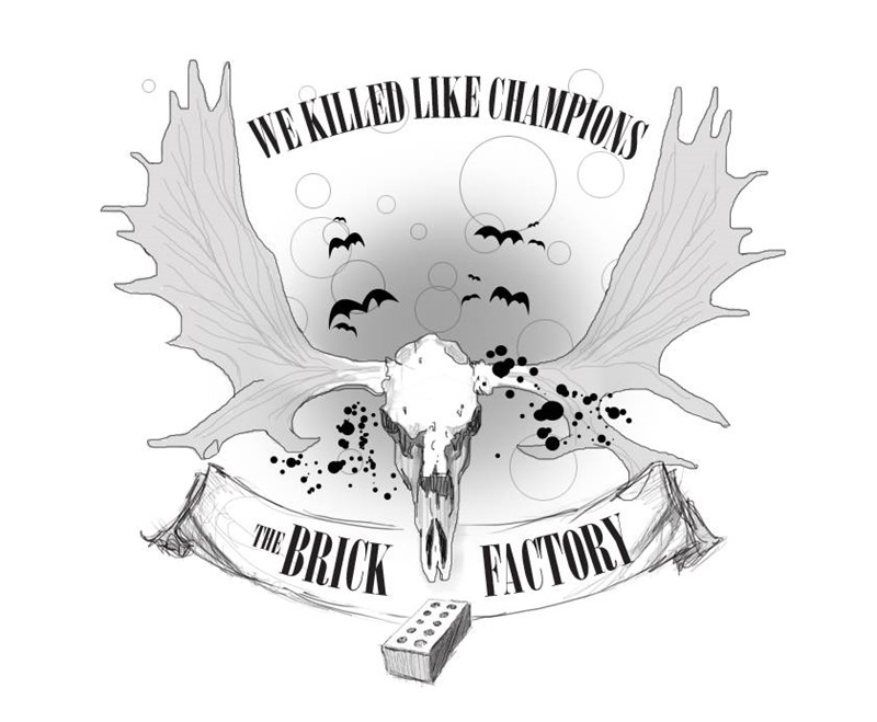
So as part of our site redesign we are developing supplemental branding elements that will be sprinkled throughout the site. Below are snippets of two such pieces of art we have created. The first is a factory illustration that is a primary branding element on our homepage. The second is a Hunter S. Thompson inspired seal we will be working into a few spots. Much more to come…


Sign up today to have our latest posts delivered straight to your inbox.