On Giving Tuesday a few months back I got seventeen emails from eleven different organizations asking me to donate to their cause online. These are great organizations I believe in and have relationships with. I would have liked to give to each and every one. But, like most Americans not named Mark Zuckerberg, I have a finite amount I can afford to donate to charity each year. Deciding who to give money to is sort of like asking a parent to choose which child they love the most.
My glut of emails on Giving Tuesday is a great indication of how competitive online fundraising has gotten for charities. Donors have tons of great choices. Charities have to fight for each and every dollar they raise online. To succeed in this sort of ulta competitive landscape, non-profits must have the small details right.
One detail that can make a giant difference is are the calls to donate on non-profit websites. Tyically very little thought is given as to how to get visitors into the donation funnel as quickly as possible once they are on a non-profit website. Amazon has spent countless hours making their online purchasing process as simple as possible. The Obama campaign was famous for using data to optimize its donation form. This kind of optimization is foreign to most charities. Most throw a big red donate button into their site header and expect the money to flow in.
Here are six non-profits that have clearly spent time optimizing their websites in an effort to maximize online donations.
(1) More than a Costume
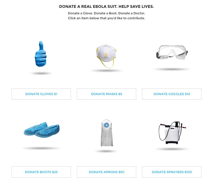
More than a Costume is a micro-site produced by Doctors of the World during last year’s Ebola outbreak in Africa. The site asks for visitors to donate money to help equip volunteer doctors with a real Ebola suite. Very good example of how to show how money will be spent to personalize the donation.
(2) charity:water
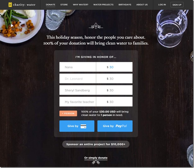
charity: water’s online fundraising efforts are consistently innovative and effective. During the 2015 giving season, their homepage asks donors to make a donation in honor of the people you care about. The ask was compelling and the donation process was dead simple.
(3) Greenpeace
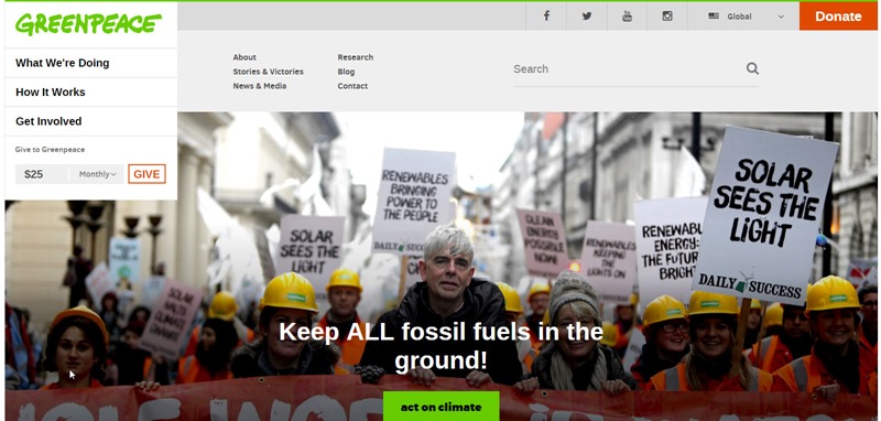
In addition to the ubiquitous big Donate button, Greenpeace includes a quick donate tool in its template that allows visitor to enter an amount and frequency. This tool, shown in the upper left of the screenshot below, is accessible on every page of its website.
(4) American Cancer Society
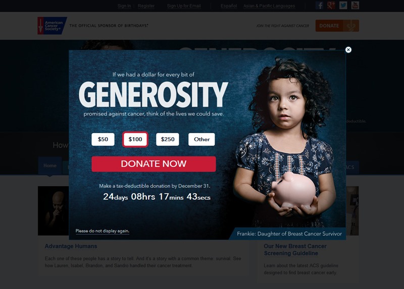
If you visited the American Cancer Society website in December, you would see the pop up below urging you to give before the end of the year. The counter is clever and the photo of Frankie is adorable. It is also a nice touch to allow use to click a button to not see the pop up on future visits.
(5) Food for the Poor
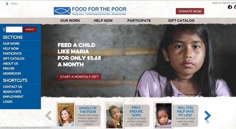
The Food for the Poor homepage includes a really compelling call to give $3.65 per month to feed Maria, a seven year old from El Salvador. If you refresh the page you will see photos of different children in the space. The site also include a quick donate feature in its site template.
(6) Invisible Children
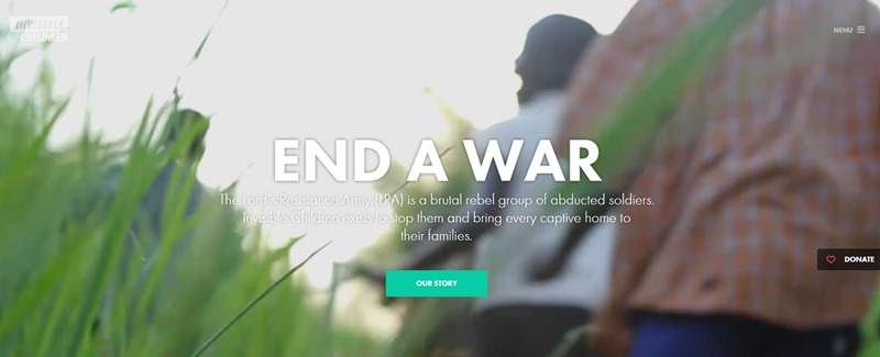
The Invisible Children website features a well designed donation button that is fixed to the right side of the page. This means the call to donate is a constant presence as you navigate the website.
Sign up today to have our latest posts delivered straight to your inbox.