Over the last few years, we have embraced a systems-based approach to website development. Instead of designing and developing page templates, we focus on defining overall styles for a site and creating reusable components called widgets. Widgets are the building blocks that content managers use to build pages.
In my Design Systems, Not Pages blog post from last year, I talked in-depth about our reasons for moving to this approach. This post will serve as a companion to that piece, providing a detailed breakdown of the process we used for our recent redesign of the African Parks website. What follows is an explanation of the design deliverables we produced and the process for building widget-powered pages using our Drupal 8 Stacks module.
Please check out this case study to learn more about African Parks and the strategy behind the redesign.
When building a site using a widget-based approach, we try to minimize the upfront design deliverables we produce. Our goal for the design process is to define overall styles and to design the building blocks (widgets) content managers will use to build site pages.
We want to get through the design process relatively quickly, and have a robust design review and polish phase after we have a working prototype in Drupal. We accomplish this by focusing on small design deliverables that are quick for our team to produce and easy for our clients to understand.
The first deliverable we typically share with clients is an overall style guide that establishes the visual language for the site. The style guide outlines the typography, palette and overall styles we intend to use. You can view the style guide deliverable we provided here.
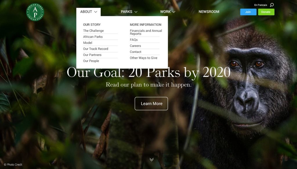
In this case, we also designed an overall navigation system for the client for both desktop (1, 2, 3) and mobile (1, 2, 3). The comp below shows the About section dropdown on desktop.
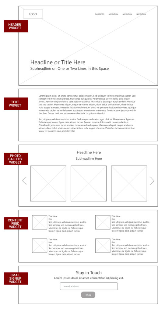
As mentioned earlier in the post, widgets are the building blocks used to build pages. Pages are simply collections of widgets added, configured, and ordered by content managers. This wireframe shows a collection of widgets that might be used to construct a page for the African parks website.
For this project, we designed sixteen unique widgets. For the sake of brevity I won’t outline every single widget here. However, I will do a deep dive on two of the widgets and provide brief overviews for a few others.
African Parks has great content assets. They have relationships with some of the world’s best wildlife photographers and have invested in breathtaking video footage of their parks. We wanted these assets to be the centerpiece of the site.
We designed a Header widget with a number of variations that is used as the first element for each page of the site. The simplest version features a photo and page title, with optional teaser text and call-to-action button.
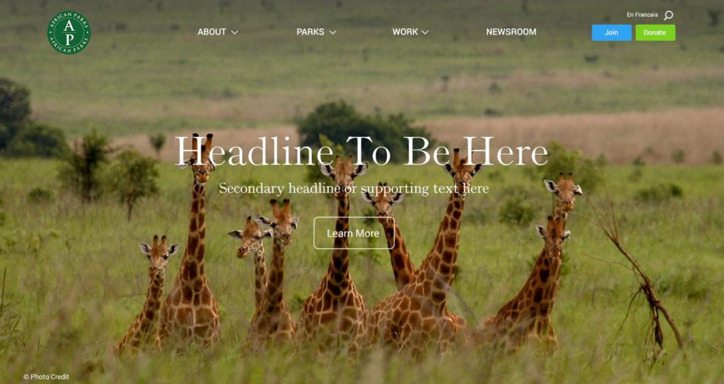
Content managers can configure the photo to take take up all or approximately 50% of the screen. They can also control the text color that appears over the photo and the alignment of the text and image (top, bottom, left, or right).
In another variation of our header widget, content managers can upload multiple photos, text and headlines, and create a slideshow that appears at the top of the page.

Given the video assets African Parks has at its disposal, we also gave them the ability to upload background videos in the header. Here is a short video demonstrating what the video header looks like.
You can view more variations of our header widget here. We also designed a text-based page intro style for pages that don’t include an opening photo or video.
African Parks produces a steady stream of original content and is fortunate enough to attract a good deal of media coverage. In light of that, we needed to create a way to display this content in lists. We designed a content feed widget that displays relevant articles in a list style. The content feed also includes optional dynamic filters, thumbnails, and pagination.
Here is a version of the widget with filters and thumbnails.
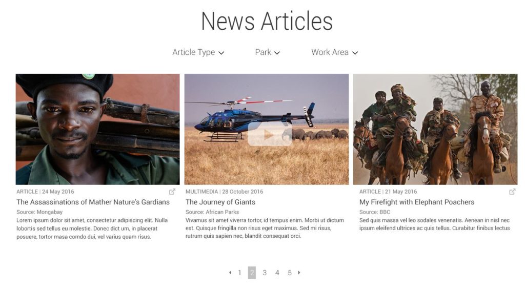
Here is a version showing more results and without thumbnails.
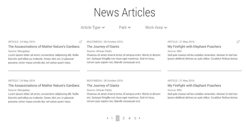
Content managers have complete editorial control over what content is shown, what filters are used, how many results are viewable, etc. You can view other variations of our content feed widget here.
As mentioned, we designed sixteen unique widgets for this project. We won’t go through all of those widgets here, but below are links to a few more to help explain the concept.
All of these widgets can be configured in a variety of different ways.
One of the reasons we went with a widget-based approach was to avoid doing a bunch of comps of complete pages (explained here). However for this project we put together a few full page comps to demonstrate what the end product would look like. These comps show pages that can be built 100% using widgets we designed for the project.
Out-of-the-box Drupal isn’t set-up to easily implement a widget-based page building approach. To bridge that gap, we built a Drupal 8 module called Stacks that makes it possible for content managers to create pages with widgets. African Parks was built using Stacks.
After creating a new page in Drupal, content managers are asked to choose what widgets they want to use. They can either select from a list of new widgets or choose to reuse an existing widget they have already configured.
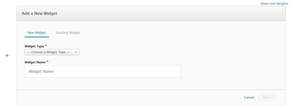
Assuming the content manager wants to add a new widget, the next step is to choose a layout variation and theme for the widget. Below are the options for our Header module for example. This has a variety of different layout options to choose from.
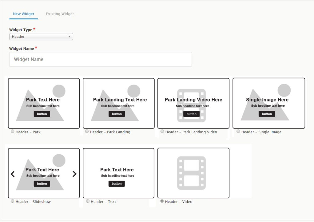
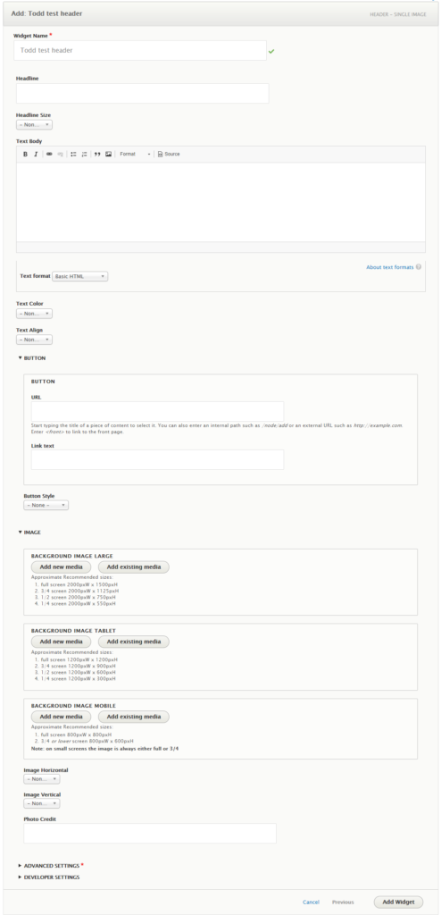
After selecting the layout, the administrator configures and enters the content into the widget. In this case, they have the option to enter text and upload images. Below are the options for our Header – Single Image layout. As you can see, content managers can enter accompanying text, add buttons, and upload and configure images for desktop, tablets and mobile.
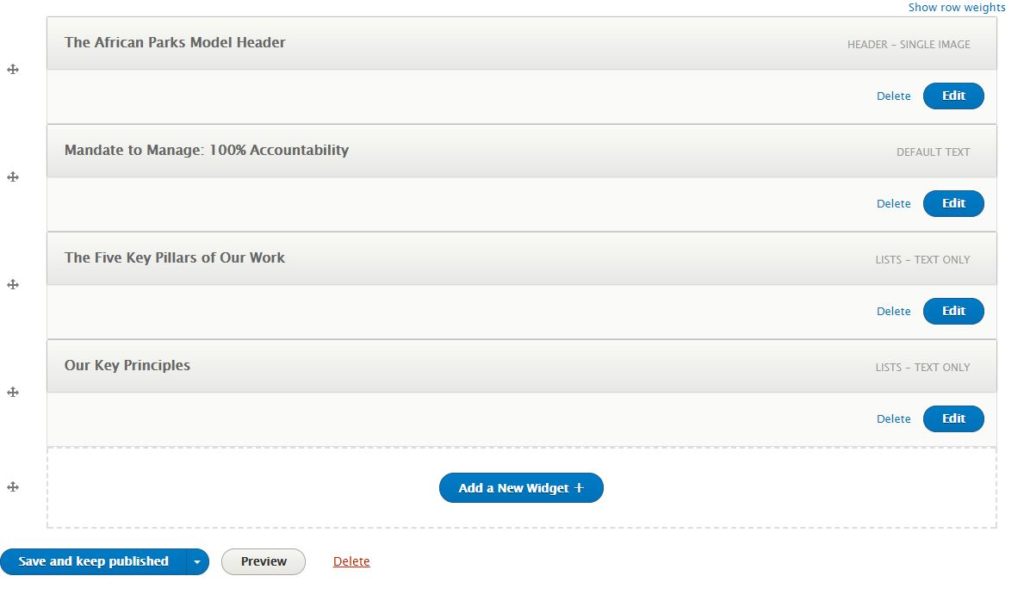
Once the widget is added to the page, you have the option to add additional widgets, edit the widgets that have been entered, and/or to reorder the widgets presented on the page. Here is an example of what a page with multiple widgets looks like on the back-end.
By using a widget-based approach for this project, we were able to efficiently design and develop a beautiful, highly effective website for African Parks. The site allows African Parks to quickly and easily build beautiful, sophisticated pages completely on their own.
Please follow the links below for examples of pages on the site that were built completely using the widget-based approach.
Sign up today to have our latest posts delivered straight to your inbox.