Late last year, we were approached by a nonprofit who had completed a website redesign project with a well respected design firm. After the new site was live for a few months, it was obvious to the non-profit that it wasn’t working. Stakeholders didn’t like it, visitors were complaining, and the site was underperforming based on all the key metrics they tracked.
The nonprofit asked us to audit the site to figure out what was wrong. We performed a quantitative analysis of usage statistics and patterns, and had our design and strategy teams complete a qualitative review of the site.
At first glance, the redesigned site seemed like it should work. It was beautiful. It featured stunning photography and a slick user interface that took advantage of the latest front-end development trends. But as we looked at the data and spent time using the site, we found some glaring flaws.
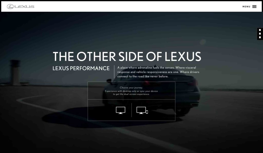
The site didn’t feature a traditional navigation bar, even on desktop. To access the site’s navigation, users had to click on a hamburger icon hidden in the top right corner. Here is an example of the approach from an old version of the Lexus website. Lexus has moved away from this approach.
In reviewing the data, we found that the vast majority of visitors weren’t opening the menu and thus had no idea of the wealth of content available on the site. As a result, critical content the nonprofit wanted to highlight wasn’t being viewed nearly as often as on the old site.
As an aside, this is a pretty common problem with this style of navigation.
The site featured full screen photos with minimal text to open each page. Users had to scroll down the page to actually view any content beyond the photo and headline. However, for aesthetic reasons the designers had completely removed the traditional scrollbar you see by default in most browsers. The only way to scroll was using the trackball on your mouse or arrows on your keyboards.
The end result is that users didn’t know to scroll. The percentage of users who scrolled down the page was much lower than what we typically see on a site with a more traditional design. Visitors thought the photo and headline were the entirety of the content available on the page.
The site featured a custom-designed donation form that looked nice but was hard to use. It featured non-traditional looking form fields and asked for a bunch of extra information from the user than was required. Where a normal donation form might ask for 8-10 pieces of information this form asked for 15.
In looking at the data, we found that an extremely high percentage of users were abandoning the donation process part of the way through. Users who were excited to give to the organization were giving up because the form was hard to use.
The site was built using a custom Content Management System (CMS). The CMS had serious performance problems and didn’t have typical caching tools in place. Further, images and videos hadn’t been properly optimized. As a result, the site loaded slowly and had frequent downtime. Sites with these sorts of performance issues are extremely frustrating to visitors, particularly ones accessing on mobile devices.
Unsurprisingly given all these usability problems, the site was not performing well against the organization’s key metrics. Bounce rates were extremely high, traffic was down, and the site wasn’t recruiting new email subscribers or donations.
We produced a report outlining the problems with the site. In the end, the client decided to start over from scratch and hired us to redesign the site.
When taking on a new website design project, it is easy to lose site of a client’s business goals and get a bit self indulgent. Let me try this new CSS technique. Let me mimic this design I saw on the Awwwards site. Let me create something I can show off in my portfolio.
Our tagline at the Brick Factory is “results matter”. The tagline is a reminder to ourselves that building a great-looking website isn’t enough. We strive to build digital programs that help our clients achieve their objectives, whether that means raising money, telling a company’s story, or recruiting passionate volunteers.
The new site we created for the nonprofit is much simpler than the design it replaced. It features a more traditional navigation system, a normal scroll bar, and fewer bells and whistles. We created a site that balanced beautiful design AND great usability.
And not surprisingly, the new site has proven to be much more effective than the old one based on every key metric the nonprofit tracks. When you’re counting on your website to deliver results, effective beats fancy every day of the week and twice on Sundays.
Sign up today to have our latest posts delivered straight to your inbox.