My third presidential candidate website review is Barack Obama (previous reviews were of Hillary Clinton and John Edwards' sites). My first impression is a positive one, as this site is constructed very solidly and allows for all of my essential user needs to be met in one pass (mostly. I have to scroll a touch to get to the networking/sharing options).
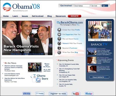
Before I get into the layout of the index page, which I like, let's get this logo figured out. On the plus side, this logo doesn't resemble any other campaign logo that I'm familiar with and that aspect alone scores big with me. The American flag, which is abused/used incorrectly on so many of these logos is pretty muted here and is part of what has to be intended as farmland. The white sunrise is a new day, I'm guessing, and the whole package creates a strong "O" that is sure to be translated to T-shirts and buttons easily. That's a lot of thought into a campaign logo. When I saw this a week ago, I didn't like it. I thought it was too Web 2.0 driven. I was probably wrong. And to the designers who came up with it, thanks for not making the O icon the first letter in his name.
As we enter the site, the Web 2.0 design elements are all there, but not too over the top or distracting. The gradients, the curves, the muted grays all exist here, but within a solid design, work well. The logo isn't reflected. Points there. The red and white flag stripes are in the header though, and that decision lost you some of those points.
The universal navigation across the bottom of the header is clear and the menus are easy to work through. The donate button is pretty obvious. I am under the impression now that "donate" must always be rendered with white letters in a red field. I have no idea why.
The main story is where my eyes travel next, and is done in a pretty unassuming way. Just a simple headline, a big image and a click through to its home in the newsroom. My.BarackObama.com feels a little weird to me, and as much as I dislike the term "Action Items", I would have preferred it here. I understand that the campaign is about me, but using the My prefix reads sort of creepy, in my opinion. The section itself is well designed and the icons + keywords look is solid.
BarackTV is where I am drawn next. The layout and navigation are very simple here and the video pulls up quickly enough. When I saw the temporary site, my fear was that users would be inundated with video. I thought that with all the excitement over viral marketing and videos from the mid-term elections that Obama's site would be really saturated with that experience. It isn't.
The site seems to fit in Upcoming Events and In The News headlines as an afterthought, but they are far from hidden. Just not given the importance of the previous sections. No real concerns there.
The page is finished with the networking links that are now part of the campaign site standard.
Overall, pretty high marks.
Click on the screenshot and rollover the numbers for further, but more trivial rumblings.
Sign up today to have our latest posts delivered straight to your inbox.