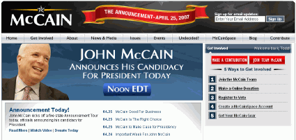
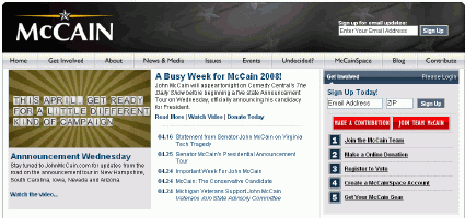
Update 2: They have tweaked the design and it is now less busy and has one big lead graphic. Although they are changing it every few minutes I think.

Update: The McCain campaign has launched their official campaign blog as well.
Original Post

Looks like the McCain team revamped their website in recent days. I think it is better from a usability standpoint.
They abandoned the black and white scheme (which was just a little too foreboding) in favor of some color. They got rid of the little video rollover effects that would surprise and annoy visitors. They are giving people the option to read some text instead of going with a “watch video or go away” approach.
However, it is a little too cluttered for my taste. I’m a fan of sites with one overriding message/graphic as the lead piece everyday (Edwards, Clinton, Obama). Also, McCain’s picture is strangely absent from the top half of the site. We’ve gone from having too many pictures of the candidate to having none at all “above the fold.” I’m sure they’ll work some McCain pictures into the flexible space on the left at some point.
What do you think?
Sign up today to have our latest posts delivered straight to your inbox.