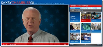
Senator Saxby Chambliss (R-GA) recently launched a new campaign website that I find vaguely fascinating. The site doesn’t look like any campaign site I’ve seen before and relies heavily on video. Campaign sites have a tendency to all look the same and I applaud Chambliss for not being afraid to try something different.
However, two things:
(1) On my laptop I actually have to scroll down on the homepage to find a Contribute or Join link and access the main site navigation. Call me old school, but I think this stuff needs to be more prominent. Design conventions exist because they help people navigate your website and quickly find what they are looking for. Usability matters.
(2) Video is great, but you have to back it up with text. The site features Chambliss talking about a variety of issues via web video, but nowhere on the site is there text expanding on the videos points. Web developers should always remember that not everyone wants to watch your video and that the web is still primarily about reading good old fashioned text. There is also this little site called Google that does much better with text than FLV files.
Regardless, I would like to thank Chambliss for taking the road less traveled with his site.
Sign up today to have our latest posts delivered straight to your inbox.