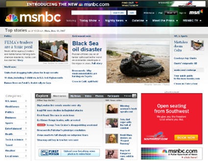
On Saturday, MSNBC launched a redesigned version of its website (via Cyberjournalist). You can view some reader reaction here and take a tour of the new site here.
I’ve never been a fan of the MSNBC website. While I think the new design is an improvement from a design perspective, the site has a long way to go before I’ll be converted into a regular visitors. Here are my specific criticisms of the new design and the overall site strategy.
(1) The navigation on the new site isn’t very user friendly. For me, the banner at the top of the page is useless from a navigation perspective. Instead of just providing me with a nice breakdown of the content of the site in the header, MSNBC uses the entire thing to advertise the sites of the Today Show and Dateline. The actual site navigation has been de-emphasized and placed at the bottom left area of the page, meaning many, many users will be scrolling to find the Health and Weather sections on the homepage.
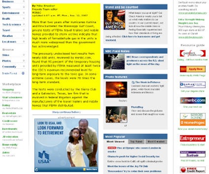
(2) The layout of the story pages makes the articles practically unreadable. The new site continues MSNBC’s long tradition of cramming their story pages with so much stuff that you have to click and scroll endlessly to read the actual article. Seriously, they devote probably 200 pixels to the display of the article text of a total width of 800+. In the screenshot below I’ve highlighted where the actual story text is.

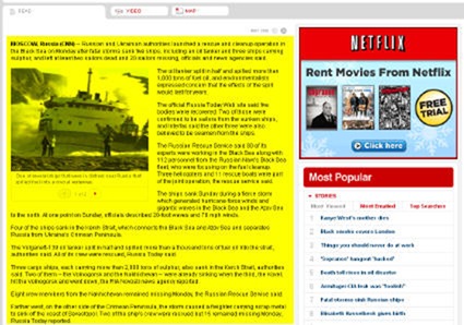
For comparison, here is a screenshot of the story page from the better designed CNN.com. Once again, actual story text is highlighted in yellow. CNN makes their stories much easier to read by devoting twice as much space to the story text.

(3) The site still insists on displaying all their videos in pop up windows. I really dislike pop up windows and have multiple blockers installed to ensure that I never see them. If you use pop ups, I’m probably going to bail on you rather than stick around and watch your video.
(4) The site functionality more or less stayed the same. Other news sites are doing innovative things and experimenting. Social networks. News aggregators. Mashups. In launching this redesign, MSNBC seems to have focused exclusively on changing the way the site looks instead of expanding its feature set. I think this was a mistake.
What do you think of the new MSNBC?
Sign up today to have our latest posts delivered straight to your inbox.