Due to low prices and marketing muscle, Go Daddy is the first name that comes to mind for me when I think of domain registration. Over the years, I have purchased a series of domain names that I manage through the site, and have even bought hosting services from them out of convenience on occasion. I have been consistently appalled by the Go Daddy user interface throughout the time I've used the service.
Yesterday, I got a renewal notice for one of the domains I own and logged into Go Daddy to reserve for another two years. In an era where most e-commerce sites have worked to make it as easy as possible to buy goods with as few clicks as possible, Go Daddy has taken the complete opposite approach. It took six clicks for me, as a logged-in account holder whose credit card is on file, to renew my domain. Previously I had always chalked up Go Daddy's horrible interface to incompetence, but upon close review it is pretty clear that the interface is purposefully clunky, and that Go Daddy is putting a lot of barriers between the user and the final purchase step in an effort to manipulate them into buying additional services.
It is the online equivalent of the candy and trashy magazines in the check-out line at the grocery store.
Here is a summary of the six steps I had to take to get to my final payment step (click on images to see full size versions).
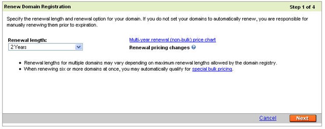
Step 1
The first step is actually pretty straightforward. I simply select the renewal length and click next.
Step 2
On step 2 of the process, I am assaulted with six additional services I can buy. I don't need any of this stuff so I click next.

Step 3
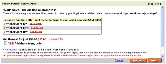
Since I didn't select anything in the previous step, I've jumped to what they say is step 4 of 4. Go Daddy now pitches me on buying additional extensions. I decline and click next.
Step 4
On step 4, I am taken to an entirely new interface and get a plethora of offers to buy additional services (hosting, email, additional storage, SSL certificates, Search Engine Optimization services and an online shopping cart). I have to scroll to the very button of the page where an inconspicuous "No Thanks – Continue to Check Out" promises to take me where I need to go.

Step 5
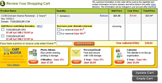
I'm now nearing my final step, and am once again given the opportunity to buy additional domains as well as a bunch of other services. After scrolling to the bottom of the page, I advance to the final step.
Step 6
Finally, we are at the point where we wind things down. From here I fill in my credit card, and click checkout (below). The next page is a standard confirmation page and I'm done.

While annoying, what Go Daddy is doing is pretty smart, if not a bit ruthless. I'm an existing customer, and I'm pretty locked in. I'll probably buy future domains here out of the convenience of having all my domains in one spot. I know there are ways to transfer domains to other services, but that seems like a hassle to me and I can't even imagine how many steps that interface has. So like it or not, I'm pretty much stuck using the purposefully awful Go Daddy user interface and will continue navigating my way through the mind field of ads. It is the price I pay for the cheap domains.
Sign up today to have our latest posts delivered straight to your inbox.