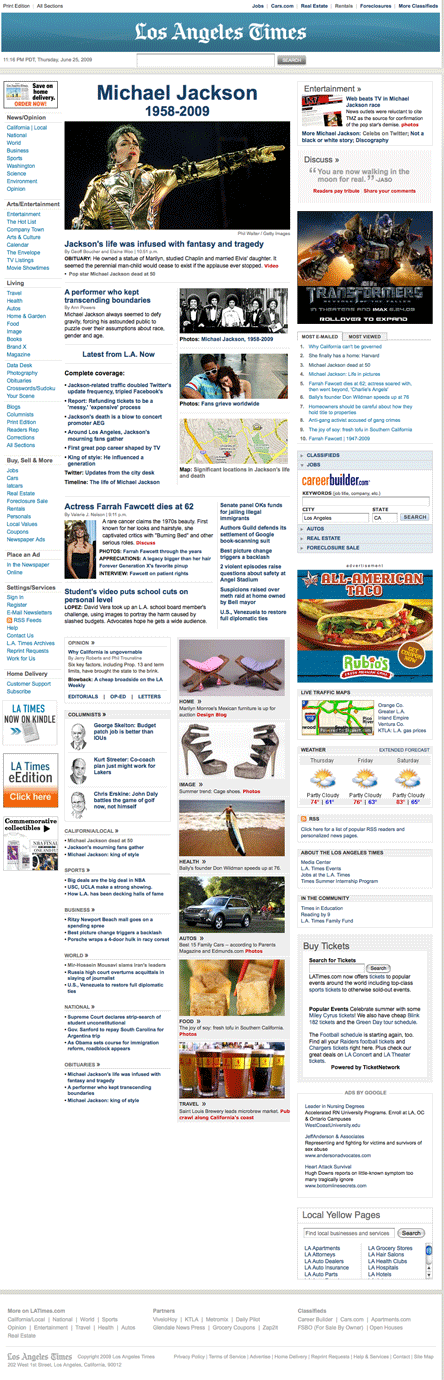
On the heels of an overhaul of their print product back in October, the Los Angeles Times launched a redesign of their website a week or so ago. I like the new www.latimes.com a great deal from a usability standpoint. The new sites prominent, simplified horizontal nav bar is a huge improvement over the more complicated content structure present on the old site. And while I’m sure some will find the black and white design unexciting, I think the palette evokes the print product and makes it easy for the eye to focus on the content. This is a nice improvement.
Check out the screenshots below to see how the site has changed. Click on the images for full before and after shots.

Sign up today to have our latest posts delivered straight to your inbox.