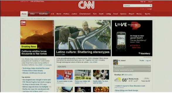
CNN is launching a new version of its website on Monday and previewed the site to select reporters yesterday. Techcrunch has the full breakdown and a slew of screen shots.
It is pretty much impossible to tell anything from the screen shots, but I’ll not let that stop me from making some superficial observations:
- As Kevin Anderson observed on Twitter, the new site moves away from the text heavy current design to what he describes as a more magazine-style layout.
- CNN is clearly not worried any longer about folks on dial up. The new site is very image and video heavy, and is clearly best experienced on a high speed connection.
- I like the white/red palette of the current site, and am not sure about this grey/beige color tone they seem to be going for. Won’t really be able to judge that until we see the site in a browser, however.
- I’m interested in seeing the NewsPulse feature, which is described as an “iTunes for news.” Whatever that means.
I look forward to giving it a full look on Monday.
