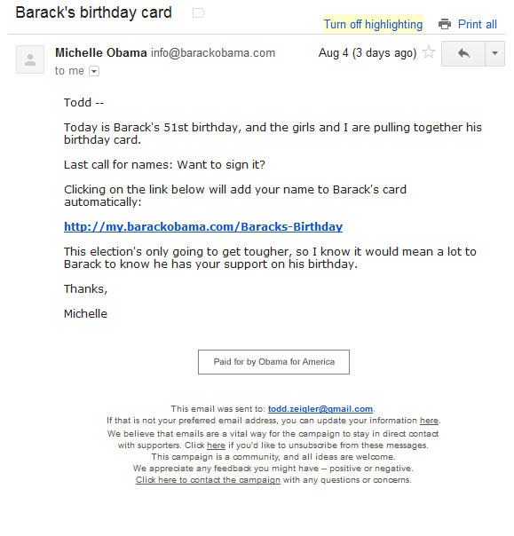
If you subscribe to the Obama email list, you are used to seeing emails that look a lot like this.

Short. To the point. Mostly text with few if any images. A single link to the action they want you to perform. And that’s it.
Over the years the Obama campaign has experimented with a variety of email layouts. Somewhere along the line they determined that simple yields the best returns, so the majority of their emails have the minimalistic look of the one above.
Yesterday, the Obama campaign sent out an email that was completely different. The email, which is embedded at the end of this post, consisted of a 6,000+ pixel infographic about the fundraising gap between Obama and Romney. I’m on a ton of political email lists and tune out most of them as noise. I read this one all the way through. It got my attention. While I’m certainly not the typical Obama supporter, I suspect the email got the attention of others as well.
When managing an email list, it is important to remember that the list consists of living, breathing people. And people get bored. The Obama infographic email is a great way to mix things up, and reengage subscribers whose attention you are struggling to keep.
I’m a big believer in keeping emails as simple as possible, but throwing a curveball like this every now and then strikes me as a great way to combat email fatigue.

Sign up today to have our latest posts delivered straight to your inbox.