With the proliferation of smart phones and tablets over the last few years, the hype about the mobile web has gotten pretty deafening. While overall industry trends are important, at the Brick Factory we are more interested in understanding how the rise of the mobile web is impacting our own world of non-profits, advocacy groups and brands.
In an effort to truly understand how smart phone/tablet usage is impacting our clients, the last few years we have taken an aggregate look at visitor trends of the websites we manage (60+ sites). Below are the key findings from our look at 2014 traffic data.
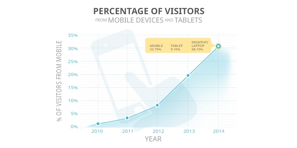
Cutting to the chase, smart phone and tablet visits to the sites we manage grew aggressively in 2014. Just under 32% of visitors came from smart phones and tablets in 2014. Here is a graph showing the trend since we starting tracking this in 2010:

After more than doubling every year from 2010 to 2013, traffic from smart phones and tablets only increased by 70% from 2013 to 2014. While I expect the percentage growth to slow further this year, I still project that by the end of 2015 close to 50% of the traffic to the sites we manage will come from smart phones and tablets.
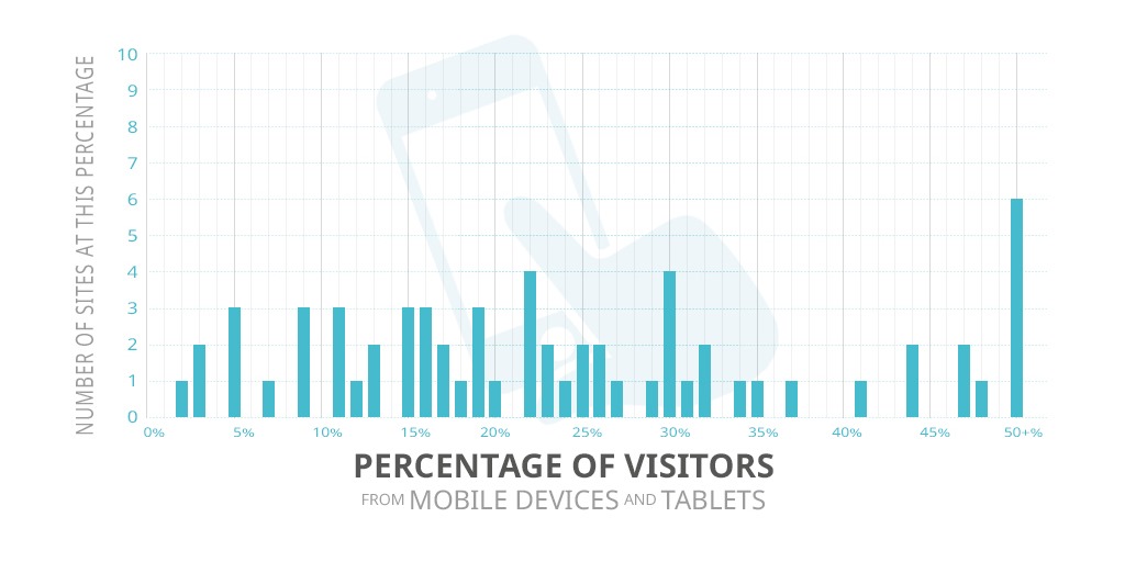
While the aggregate trend is obviously important, diving into the data it is clear that each site has its own unique story to tell. Traffic from mobile devices ranged from 2% to 70% among our client base. Here is a graphic that demonstrates how much the mobile/tablet traffic percentage varied from site to site.

The audience and goals of a site/organization has a huge impact of how much traffic comes from smart phones and tablets.
As an example, one of our clients is a company that focuses on professional development for large corporations. Since their clients are primarily accessing their web properties from work computers during office hours, their mobile/tablet percentage was only around 15%. Due to the nature of their work, their target audience tended to access the site from desktops/laptops more often than our average client.
Contrast that with another client that is a large advocacy group. This client maintains an active blog, sends out daily email alerts and frequently comments on breaking news. 50% of their traffic comes from mobile and tablets.
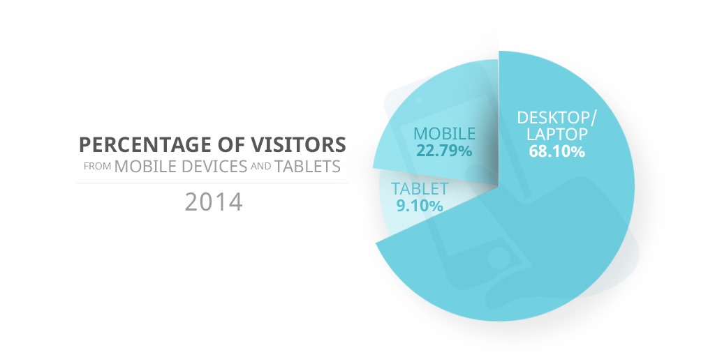
Smart phones were used to access the sites we manage more than twice as often as tablets.

Interestingly, we saw a moderate increase in overall traffic from desktops and laptops. This increase was just dwarfed by the more dramatic increase in accesses from mobile phones and tablets. For our clients at least, the story isn’t that desktop and laptop usage is dying, it is that visits from phones and tablets are exploding.
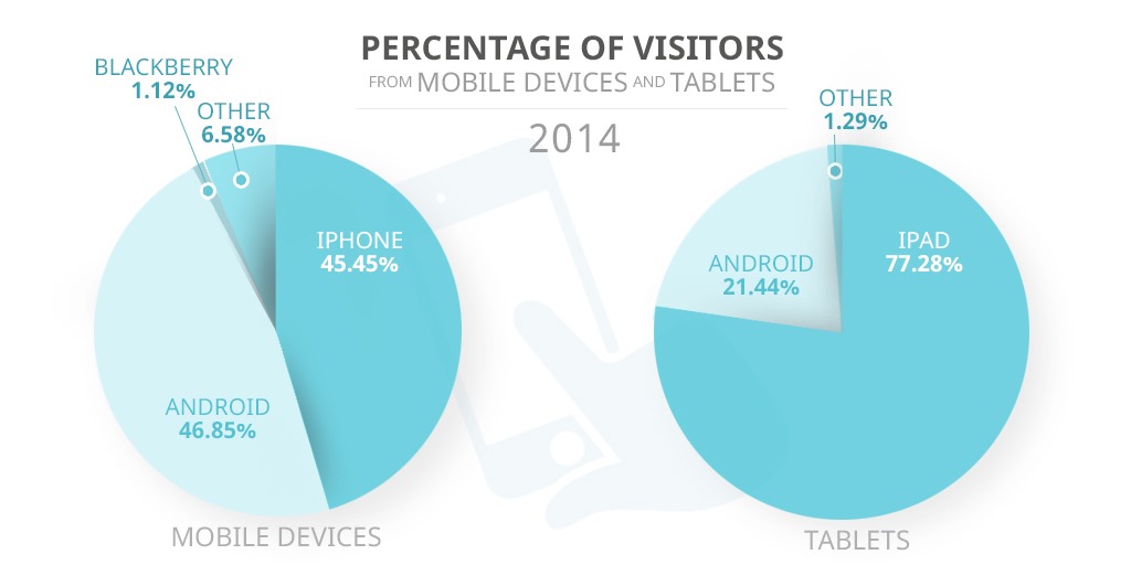
Interestingly, more people accessed the sites we manage from Android smart phones than from iPhones in 2014. The iPhone was the dominant device from 2010-2013. The iPad continues to dominate the tablet market.

The conclusion here is obvious: responsive design is now the rule and not the exception.
Back in 2010 and 2011, when planning projects we treated making a site mobile-friendly as a nice-to-have for most of our clients. The percentage of visitors coming from smart phones and tablets often didn’t justify the added time and cost required to make a site mobile-friendly. Creating a great mobile and tablet experience is now very clearly a requirement for every project we work on.
Sign up today to have our latest posts delivered straight to your inbox.