The 2020 Democratic Presidential primary is in full swing. As someone who used to work in politics and still builds website for a living, I have an interest in campaign websites and always check them out. Given how wide open the race is, I decided to share my thoughts after reviewing the sites of all major 2020 Democratic Presidential candidates.
Without further ado, below are my personal ranking of the websites from best to worst to incomplete, with an accompanying letter grade.
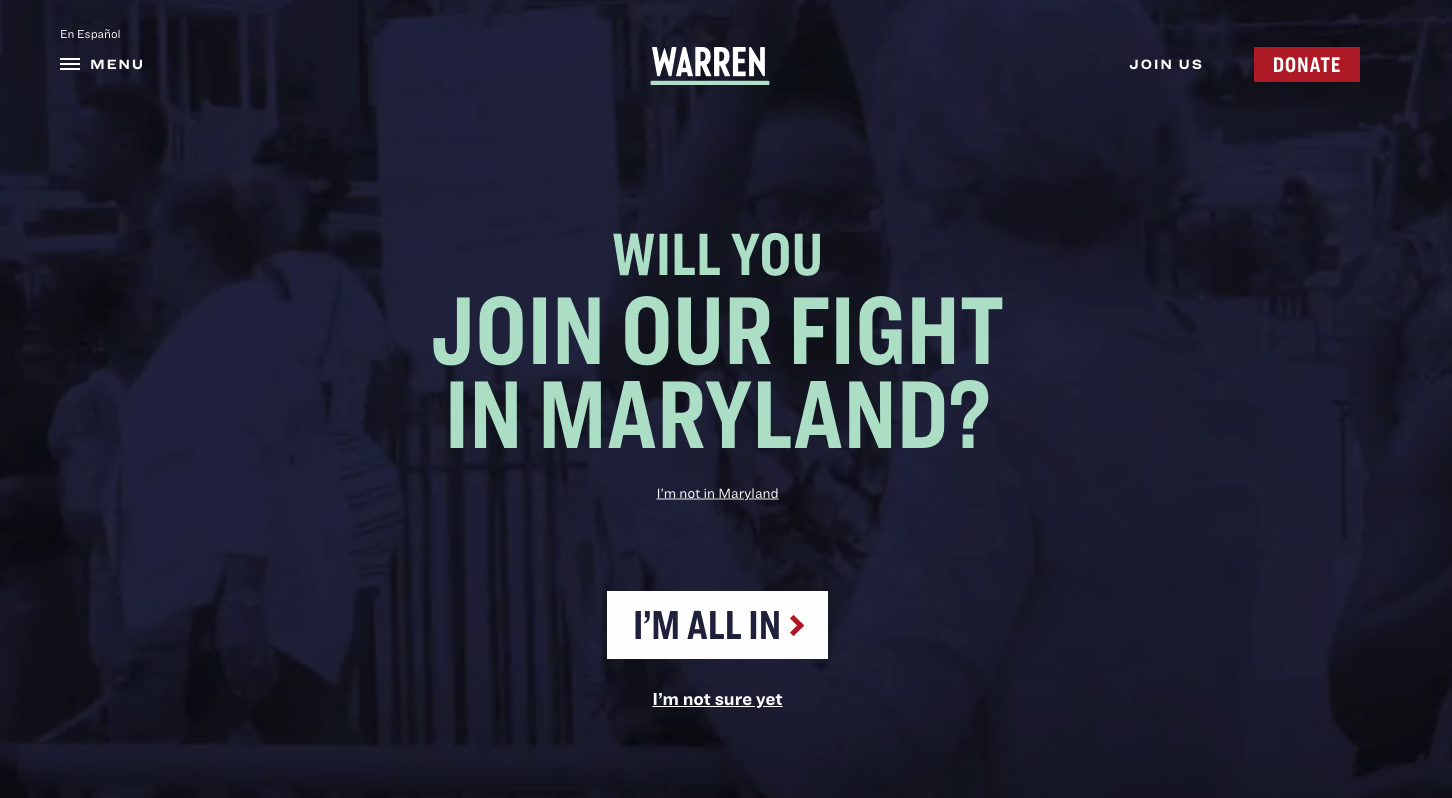
Love that the site customizes the language on the homepage based on location (“Will you join our fight in Maryland”). This is also the most full featured of the sites. There is a Fact Squad page, a full featured Issues section, and you can peruse her tax returns.
I wanted to give Warren a higher grade since her site is the most substantive, but she gets docked for usability problems. You have to really look to figure out how to sign up for email and text updates. Both the Join Us and Donate links take you to donation pages. And there is an annoying horizontal scroll effect as you navigate the homepage.
| Feature | Present on Site? |
| Biography | Yes |
| Issues Section | Yes |
| News / Blog | No |
| Spanish Language | Yes |
| Email Sign Up | Yes |
| Text Message | Yes |
| Donate | Yes |
| Events | Yes |
| Merchandise | Yes |
This review was updated on 4/16/2019 after The Buttigieg campaign launched a new site.
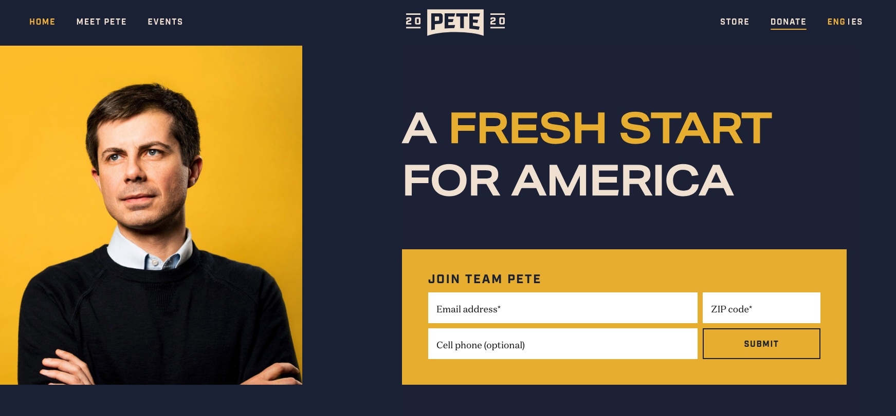
The Buttigieg campaign launched a new website and online brand as part of his official campaign roll out on April 14, 2019. The new site is a nice improvement. The red, white, and blue palette from the old site have been replaced with a unique blue and yellow scheme. The new site features a design toolkit that provides volunteers with graphic assets they can use to design their own campaign materials.
While slick the new site is still pretty substance free. There is no issues section outlining even superficial stances on issues. Given how professional the design is, I’m surprised at the poor user interface for the English/Spanish language site toggle. Given the use of all caps and a pipe to separate the options, the “ENG | ES” navigation elements looks like “ENGIES”. I was confused by the navigation point so clicked on it wondering what it meant.
| Feature | Present on Site? |
| Biography | Yes |
| Issues Section | No |
| News / Blog | No |
| Spanish Language | Yes |
| Email Sign Up | Yes |
| Text Message | Yes |
| Donate | Yes |
| Events | Yes |
| Merchandise | Yes |
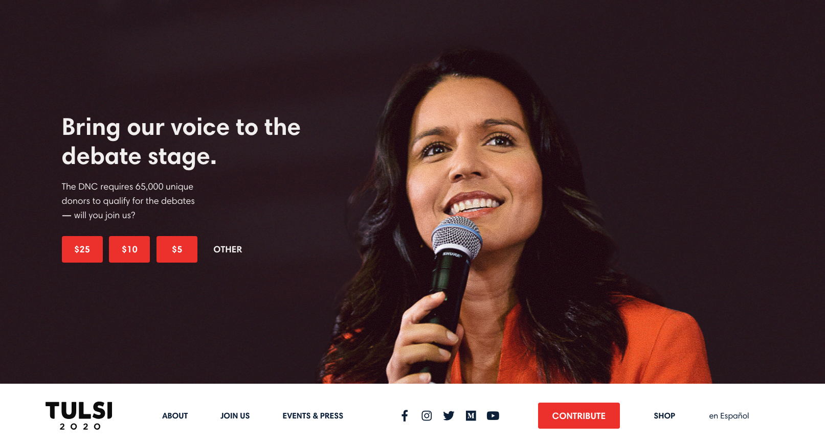
This is a really good site. Great use of photography throughout, easy to navigate, and looks great on mobile. The is also full featured and really emphasizes growing their text message list. Fantastic bio page.
The events section links to her Facebook events page, and there weren’t any upcoming events listed.
| Feature | Present on Site? |
| Biography | Yes |
| Issues Section | No |
| News / Blog | Yes |
| Spanish Language | Yes |
| Email Sign Up | Yes |
| Text Message | Yes |
| Donate | Yes |
| Events | Sort Of |
| Merchandise | Yes |
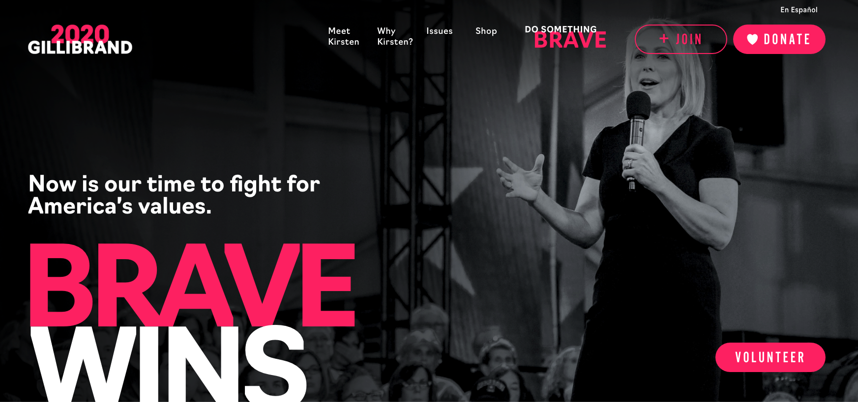
This site is slick. From the palette and typography to the “Brave Wins” tagline, the branding is cohesive and works well. Site is full featured and fairly easy to navigate.
The site has a few too many competing calls to action for my taste. On the homepage we have calls to “Do Something Brave”, join, donate, and volunteer. At times it feels like they use fancy transitions, that might be disorienting for some, just so they can.
| Feature | Present on Site? |
| Biography | Yes |
| Issues Section | Yes |
| News / Blog | Yes |
| Spanish Language | Yes |
| Email Sign Up | Yes |
| Text Message | Yes |
| Donate | Yes |
| Events | No |
| Merchandise | Yes |
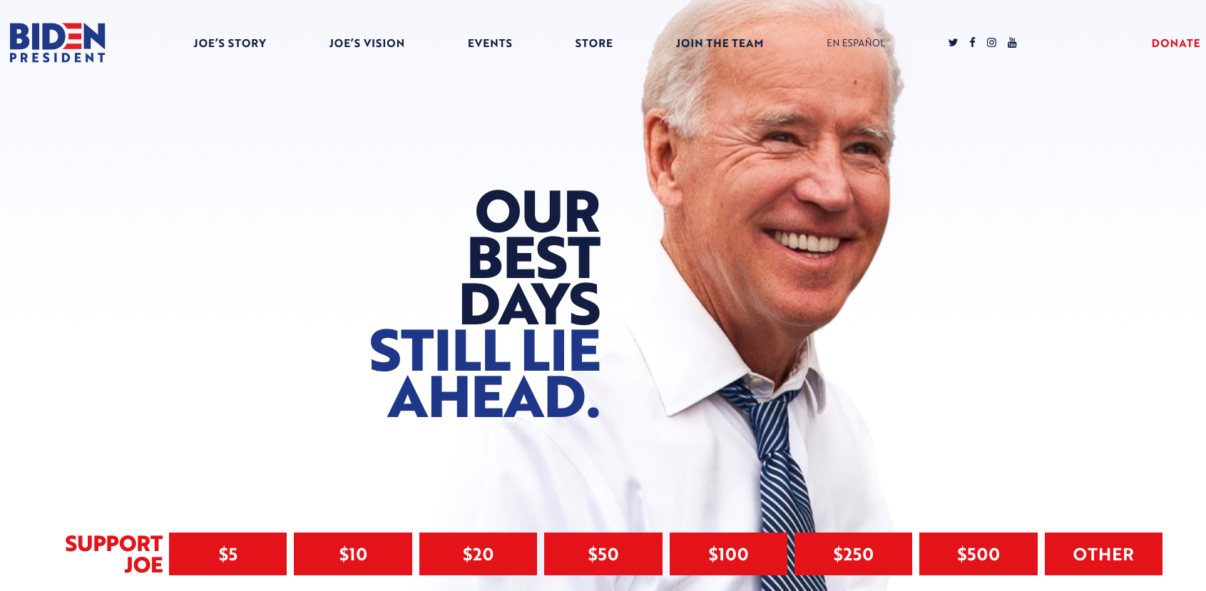
While other candidates have strayed from the typical red, white, and blue campaign site palette, Biden is leaning into it. He adds a fresh take on the color scheme by making white the dominant color with red and white used as accents. I think it works. I also like some of the design touches: great use of photography, the reference to Amtrak on the bio page is fun, and I love how the donation options follow you throughout the site.
The Issues section on the site is a bit skimpy compared to some of the other candidates. I love the personal photos on the site, but am not wild about some of the stock photography. As an example, the photo on the homepage of millennials wearing Biden gear while staring into the future made me cringe. It looks like the Biden logo was photoshopped on stock photography.
| Feature | Present on Site? |
| Biography | Yes |
| Issues Section | Yes |
| News / Blog | No |
| Spanish Language | Yes |
| Email Sign Up | Yes |
| Text Message | Yes |
| Donate | Yes |
| Events | Yes |
| Merchandise | Yes |
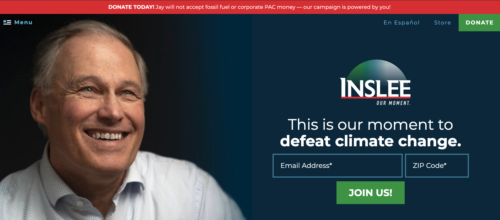
Inslee is running on climate change and through branding and language the site makes that super clear. Solid design, clear calls to action, and easy to navigate.
No way to sign up for text message. While I understand what they are going for with the logo, I personally don’t think it works that well.
| Feature | Present on Site? |
| Biography | Yes |
| Issues Section | Yes |
| News / Blog | No |
| Spanish Language | Yes |
| Email Sign Up | Yes |
| Text Message | No |
| Donate | Yes |
| Events | No |
| Merchandise | Yes |
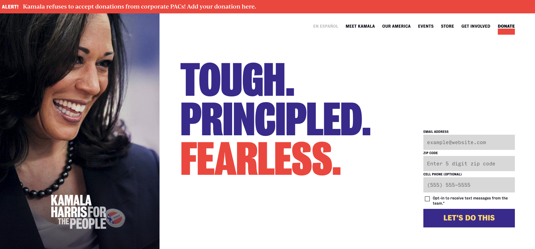
I think the “Kamala Harris for the People” logo and “Tough Principled Fearless” tagline do a good job of conveying what Harris is about. Site is easy to navigate, has strong typography, and uses photography well.
The navigation bar fonts are too small and the seven options are all given basically given the same weight. I would rework the site’s navigation system to establish a clearer hierarchy.
| Feature | Present on Site? |
| Biography | Yes |
| Issues Section | No |
| News / Blog | No |
| Spanish Language | Yes |
| Email Sign Up | Yes |
| Text Message | Yes |
| Donate | Yes |
| Events | Yes |
| Merchandise | Yes |
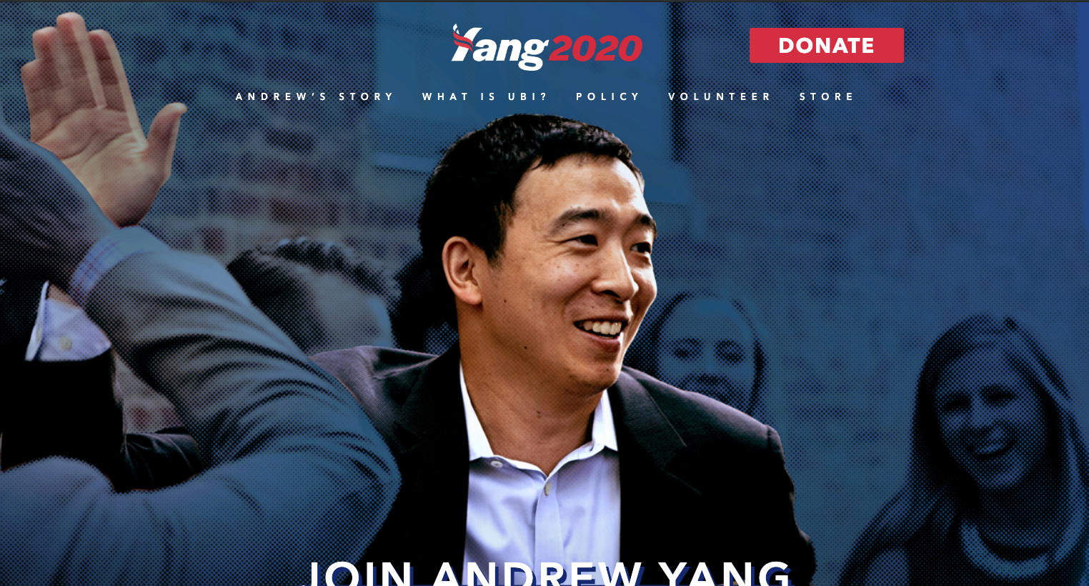
Yang is running on a guaranteed Universal Basic Income and the site makes that really clear. Yang has the most thorough policy section of any candidate. The site is quirky and has a personality that most others sites lack.
Most of my criticisms are around small design details. On my monitor, the pages don’t frame well. For example, on the homepage the email sign up is below the fold when it clearly was designed to be above. That donor ticker featured on the homepage is really something.
| Feature | Present on Site? |
| Biography | Yes |
| Issues Section | Yes |
| News / Blog | Yes |
| Spanish Language | No |
| Email Sign Up | Yes |
| Text Message | No |
| Donate | Yes |
| Events | Yes |
| Merchandise | Tes |
Not as slick as some of the other sites but very functional. Clear navigation options and you can find everything easily. I like that he has a nontraditional donation button, although having reviewed the data I can tell you there is a reason they are usually red. More full featured than some of the other candidates.
Really nothing obvious not to like as there are no obvious features missing and the design is professional. I find the branding a bit generic as it feels very reminiscent of the Obama sites.
| Feature | Present on Site? |
| Biography | Yes |
| Issues Section | No |
| News / Blog | Yes |
| Spanish Language | Yes |
| Email Sign Up | Yes |
| Text Message | Yes |
| Donate | Yes |
| Events | No |
| Merchandise | Yes |
This is a slick looking site with strong branding. The site copy is well written and his bio video is fantastic. I was impressed that the site probably worked better on mobile than on desktop.
This site is form over function.The site’s navigation system doesn’t show up until a user scrolls. As a usability nerd I hate this: why on Earth would you make a user scroll before they are shown a donate link? While I appreciate the initial focus on harvesting email and phone numbers, it bothers me that the site keeps asking for my email even after I sign up. Why keep asking for email when you’ve already got it?
| Feature | Present on Site? |
| Biography | Yes |
| Issues Section | No |
| News / Blog | No |
| Spanish Language | Yes |
| Email Sign Up | Yes |
| Text Message | Yes |
| Donate | Yes |
| Events | Yes |
| Merchandise | Yes |
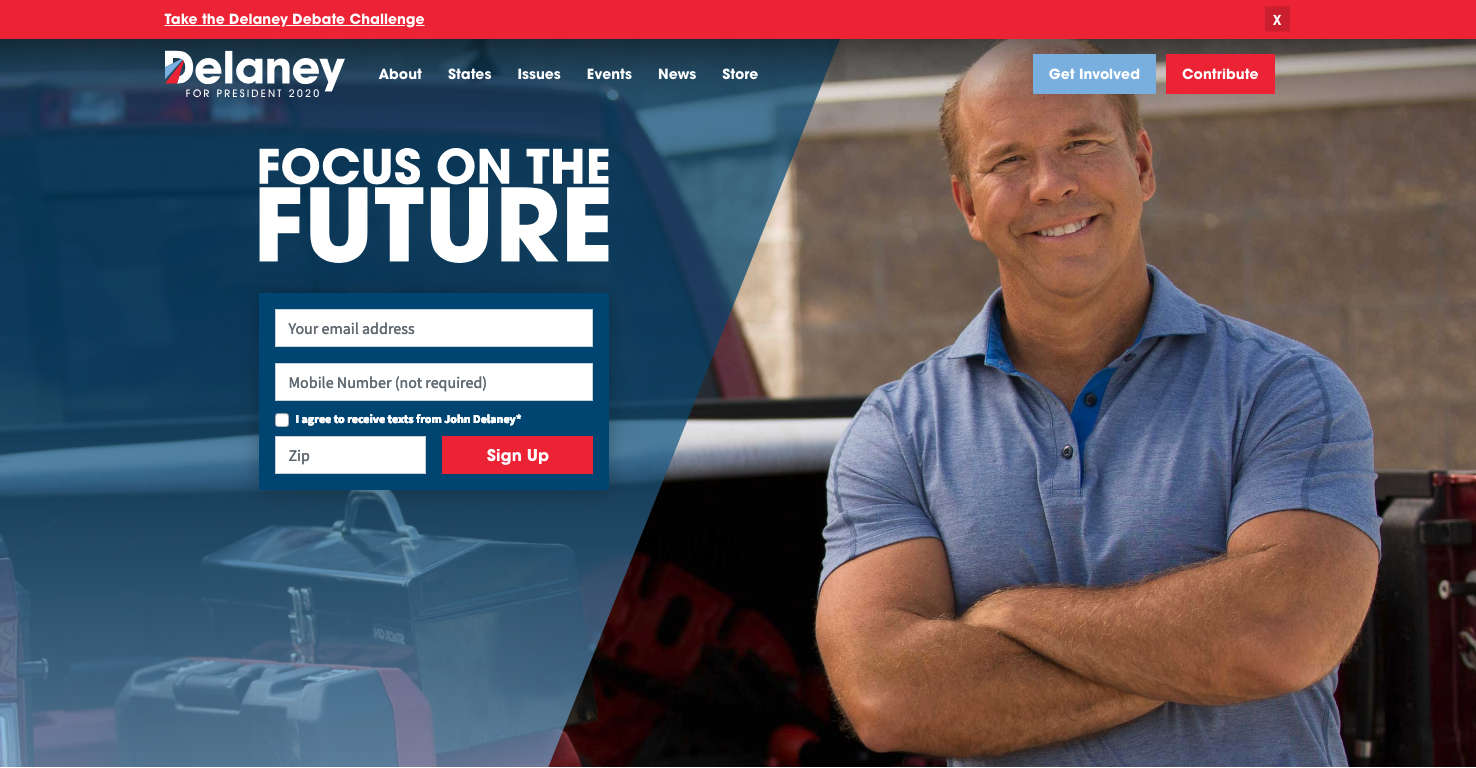
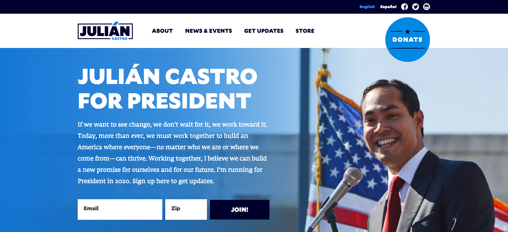
The site is full featured and unlike some other candidates it includes an issue section, although it is clearly still a work in progress. Site is easy to navigate. He has a pretty robust bio section and already has landing pages for Iowa and New Hampshire.
I’m not sure about that opening photo with the pick up truck, tools, and biceps. While there is nothing wrong with it, the overall site branding feels generic.
| Feature | Present on Site? |
| Biography | Yes |
| Issues Section | Yes |
| News / Blog | Yes |
| Spanish Language | No |
| Email Sign Up | Yes |
| Text Message | Yes |
| Donate | Yes |
| Events | Yes |
| Merchandise | Yes |
It is easy to use?
This site looks like something that was thrown together quickly as a placeholder with the idea of building something more full featured later. No bio. No text message sign up. I expect (hope) that they build it out more fully down the line.
| Feature | Present on Site? |
| Biography | No |
| Issues Section | No |
| News / Blog | No |
| Spanish Language | Yes |
| Email Sign Up | Yes |
| Text Message | No |
| Donate | Yes |
| Events | No |
| Merchandise | Yes |
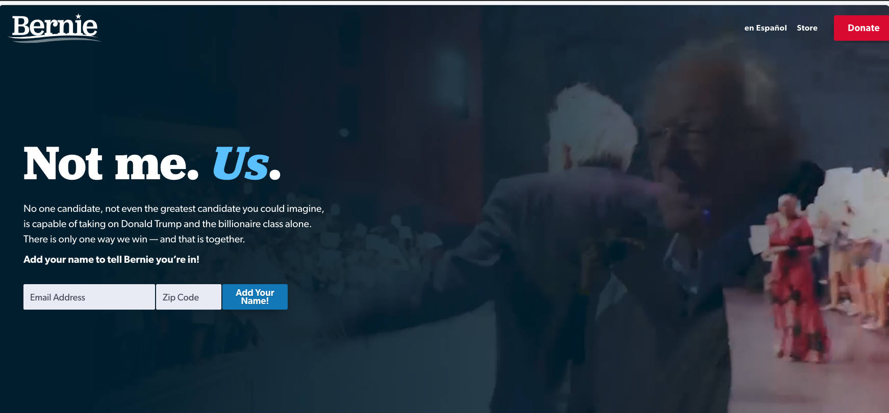
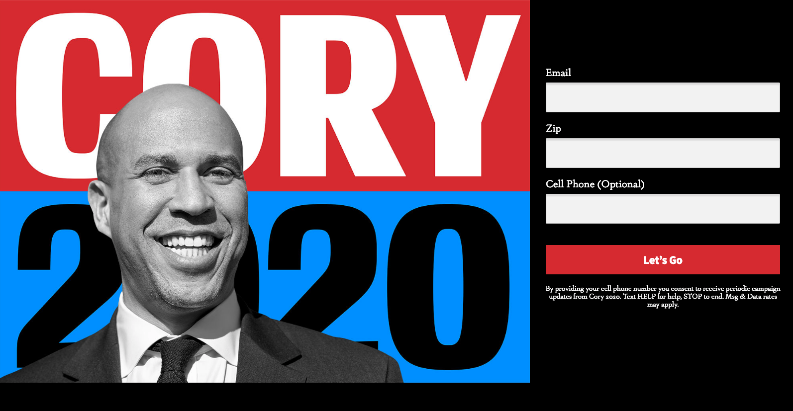
I like the tagline (“Not me. Us.”) and use of video to open the site instead of a photo.
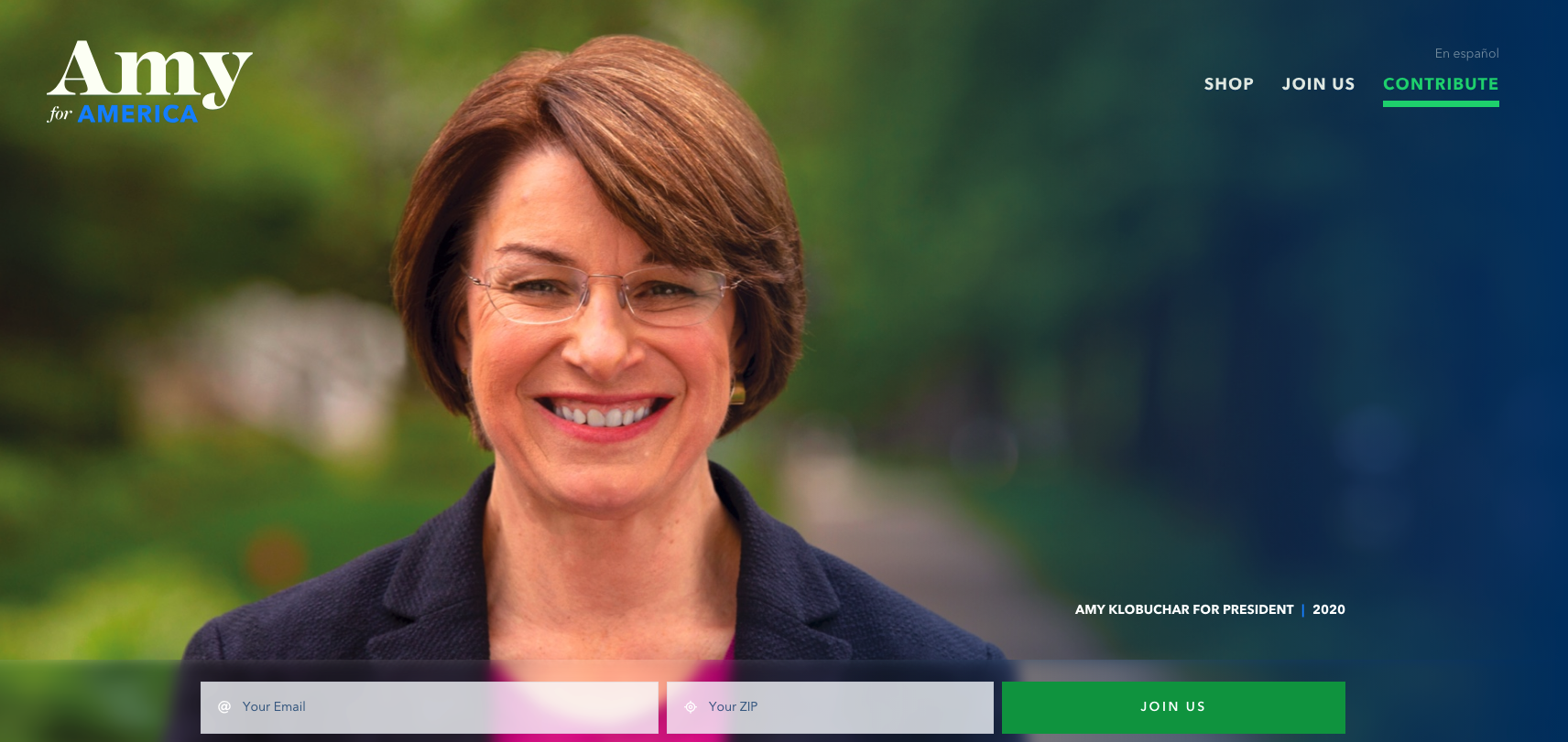
Like with Amy Klobuchar, this feels like a placeholder site as there is really nothing to it. All you can do is donate and join the email list. Not even a biography.
| Feature | Present on Site? |
| Biography | No |
| Issues Section | No |
| News / Blog | No |
| Spanish Language | Yes |
| Email Sign Up | Yes |
| Text Message | No |
| Donate | Yes |
| Events | No |
| Merchandise | Yes |
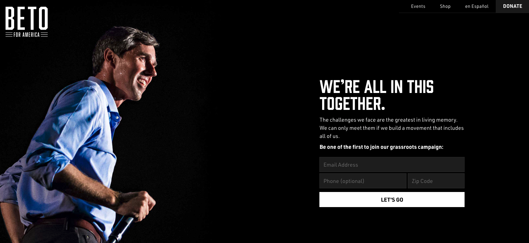
Beto has strong branding. The palette, logo, typography, and use of photography are all really well done and work.
No bio. No issues. This is likely a placeholder site until they launch something more full featured down the road. The animation that you are forced to watch when you visit for the first time is pointless and painful.
| Feature | Present on Site? |
| Biography | No |
| Issues Section | No |
| News / Blog | No |
| Spanish Language | Yes |
| Email Sign Up | Yes |
| Text Message | Yes |
| Donate | Yes |
| Events | Yes |
| Merchandise | Yes |
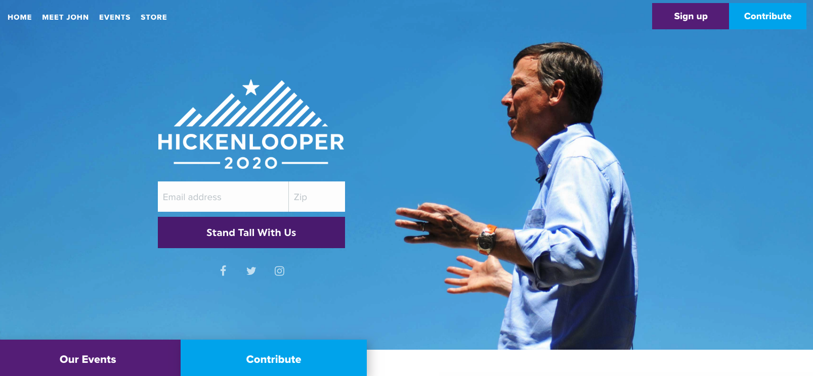
Logo and palette are pleasing?
I’m going to assume this is a placeholder site that will get fleshed out later. As a candidate most people don’t know a lot about, site doesn’t do a good job of explaining why he is running. I don’t like the “Stand Tall” tagline.
| Feature | Present on Site? |
| Biography | Yes |
| Issues Section | No |
| News / Blog | No |
| Spanish Language | No |
| Email Sign Up | Yes |
| Text Message | No |
| Donate | Yes |
| Events | Yes |
| Merchandise | Yes |
Sign up today to have our latest posts delivered straight to your inbox.