Human being are fallible creatures, so when surfing the web it is inevitable that they will occasionally mistype a URL or try to access a page that no longer exists. When this happens visitors hit a site’s 404 error page which tells users and search engines that the page they are looking for can’t be found.
On most sites the 404 page is a throw away. It is the last thing that web developers put together and not a lot of thought is put into it. This 404 page from the Washington Post is an example of the sort of soulless 404 page you typically run into.
However some sites go the extra mile and use their 404 pages as an opportunity to connect with visitors by highlighting key content and/or showing some personality. Here are twenty sites, presented in no particular order, that have taken the time to put together outstanding 404 pages.
On her Presidential campaign website Hillary Clinton uses her 404 pages to show her playful side.
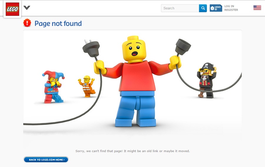
Lego shows a simple piece of artwork that reinforces what the company is about.
Dating site eHarmony uses its 404 page to show a sense of humor and, perhaps more importantly, to sell subscriptions.

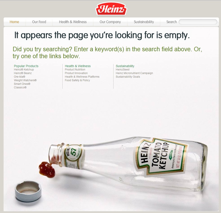
Heinz uses its 404 page to highlight its most iconic product, its ketchup.
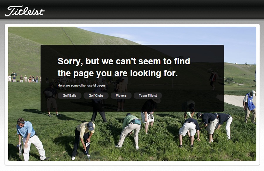
Golf equipment manufacturer Titlelist uses its 404 page to highlight one of the more frustrating aspects of playing golf: the aimless search for mishit golf balls.
A playful 404 page from ESPN soccer site, www.espnfc.com.
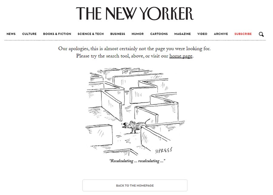
The New Yorker uses its 404 page to highlight one of its iconic cartoons.
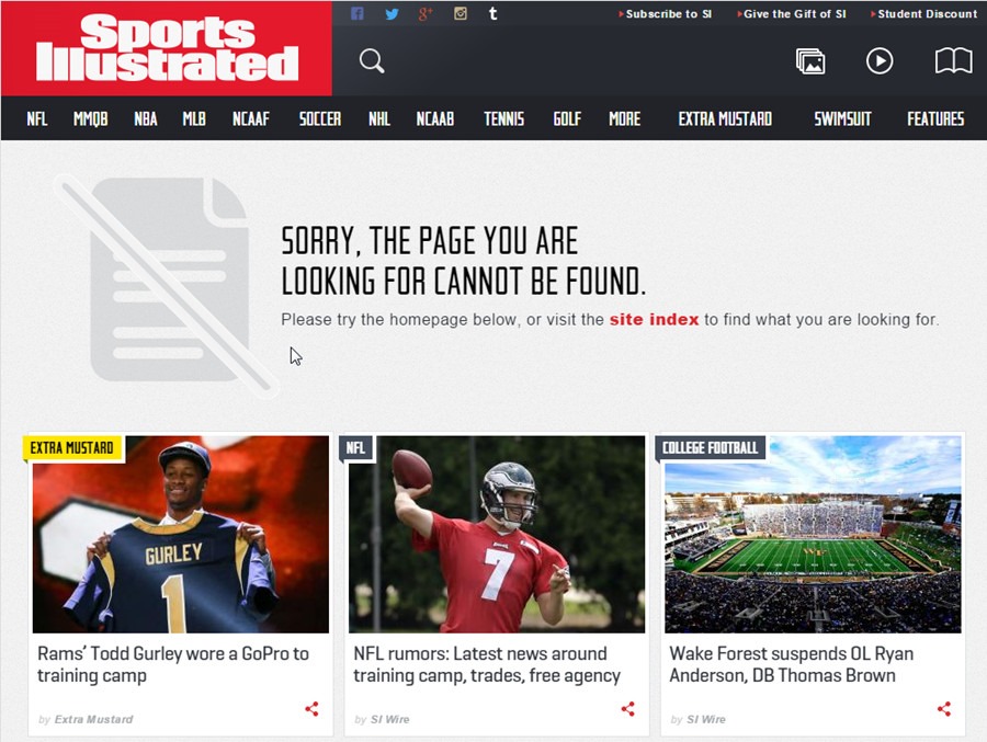
Sports Illustrated uses it 404 page to route users to its latest articles.
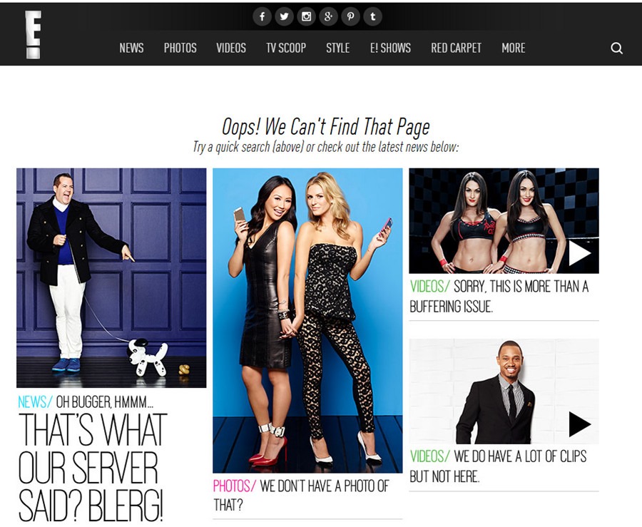
E Online with a 404 page that is very similar to the Sports Illustrated model.
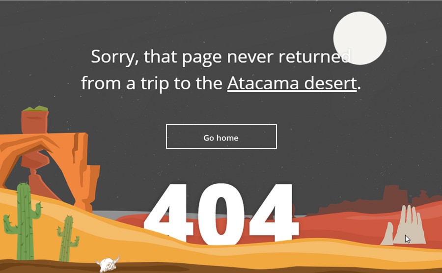
A beautiful, animated 404 page from travel site Tripomatic.
A tongue in cheek effort from software company Krit. The 404 page includes a video loop of a riveting ping pong match.

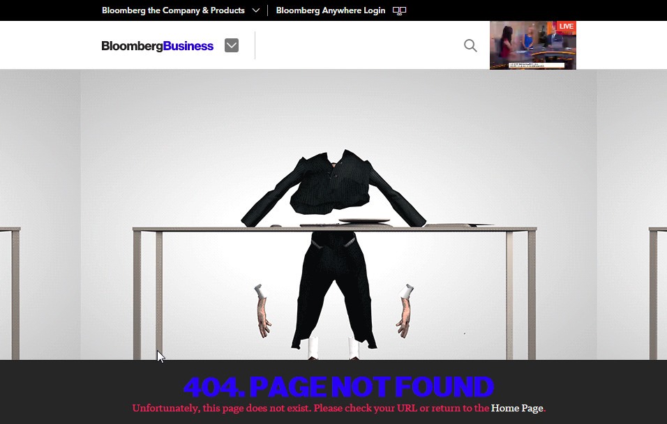
While perhaps not technically good, the bizarrely violent 404 page of Bloomberg Business had to make the list. Be sure to click through to see the full animation.
A French web developer has turned his 404 page until a full on video game. Be sure to click through to save some lemmings.

A conventional, sitemap-based 404 page from Apple. This is a good model for those who want to keep it simple.
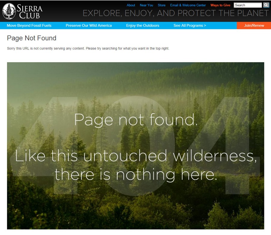
The Sierra Club uses its 404 page to reinforce its mission.
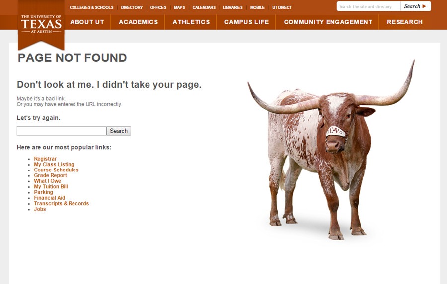
The University of Texas turns its 404 page over to its iconic mascot, Bevo.
Squarespace plays off the famous “Houston, we have a problem” quote from the Apollo 13 moon flight.

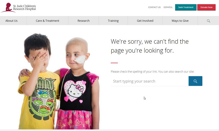
St. Jude’s simple 404 page beautifully conveys what the hospital is about.
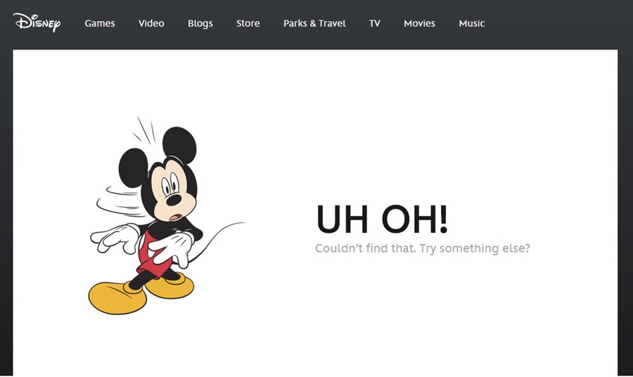
I think we all would have been disappointed if Disney’s 404 page didn’t feature Mickey Mouse.
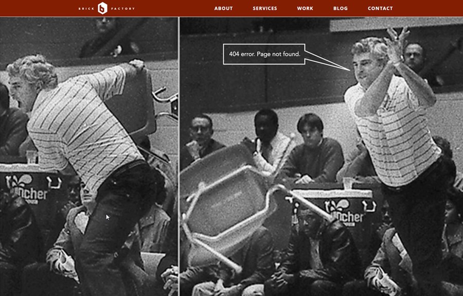
And we close with a shameless bit of self promotion. Our Brick Factory 404 page pay homage to noted sociopath Bobby Knight.
Sign up today to have our latest posts delivered straight to your inbox.