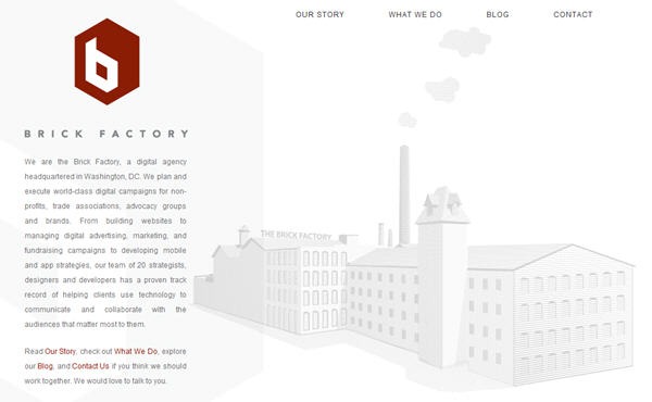
When we officially launched the Brick Factory on October 1, 2011 we quickly put together a four page website + blog in the days leading up to the announcement. Due to time constraints, the placeholder site, which is still up, is dead simple. The homepage features our logo, a paragraph of text and an illustration of a factory. I wrote a few pages of content. And that is basically it. We intended to build a more ambitious website before the end of 2011. We had big ideas and our plan was to completely start over.
And then stuff happened. Client work. Football season. Holidays. More client work.
We finally got the design process started back up in early 2012. We set out to build the Taj Mahal of digital agency websites.
We researched. We made wish lists. We site mapped. We wire framed. We designed.
And after a month of work we came to the realization that we didn’t like any of the new designs we had come up with as much as we liked the original design we had quickly put together back in late September. The new concepts were a little too complicated and tried a little too hard. We were overthinking things. The end result was something that looked like what everyone else was doing.
The original design just felt like a better fit for us for a variety of reasons:
So instead of starting over we decided to get out of our way and to build on top of the original design we put together in late September. Look for Version 1.1 in early April. Below is a sneak peak at some of the new sections and features we will be launching. Click on the full screen option for a better view of the designs.
Sign up today to have our latest posts delivered straight to your inbox.