At Brick Factory we use an agile software development process to complete our website development work.  Put very simply, this means we break up the work that needs to be done into smaller pieces called user stories.  These stories are then prioritized and completed during a series of two week work sprints.  We use a project management tool called Jira to manage all of this.  

In order for all of this to work, the user stories that we write must be easy to understand.  This is easier said than done. In this post I will walk through some common problems we’ve seen with user stories, explain what makes a good user story, and walk through an example.

Common Problems with User Stories

When we started using agile we focused on training people on the big concepts and not as much on smaller details like how to write a good user story.  As a result, our team members tended to each have their own styles and would sometimes take shortcuts. Here is a list of the most common problems we have seen.

  • Not breaking user stories up into multiple stories and/or subtasks.  The bigger the user story the harder it is to complete and test.  We’ve had problems with people creating large stories that end up staying open for long periods and generate endless Jira discussions.
  • Copying client requests verbatim without providing additional details.  The client emails a request and we simply copy it into Jira without providing additional clarification.
  • Leaving out important details.  Tickets are created that simply leave out important details that are needed to complete the work.  
  • Not clearly defining the expected outcome.  Sometimes when writing user stories the acceptance criteria aren’t clearly defined.  This makes it difficult for developers to know exactly what they are supposed to do and time gets wasted.

What Makes a Good User Story

The characteristics of a good user story are pretty obvious, but just to reiterate below are the basic criteria we developed at Brick Factory: 

  • Concise and clear.  You don’t want to be too wordy as we know people are likely to skim.
  • Have all relevant details.  While we want the story to be as concise as possible, we also want to make sure to include all relevant details need to complete the ticket.
  • What needs to be one is obvious.  The story should include clear acceptance criteria so the developer understands what it means for a story to be done.

Industrywide, the standard agile user story is written in the following format:

As a < type of user >, I want < some goal > so that < some reason >.

While I’m sure this format works for some companies, we do not use this convention at Brick Factory.  For the work we do, this format ends up being really forced and awkward. We didn’t want to follow that ticket format just because everyone else uses it.  We came up with a simple ticket format that works for us:

  • Description. Provide a concise yet thorough description of the user story.  For stories, we try to focus on detailing the problem we are trying to solve.
  • Definition of Done. State very clearly what the acceptance criteria for the story is in bullet format.  Explain what end product or result you are expecting.

User Story Example

All of this is very conceptual at this point so I wanted to walk through a hypothetical example that is based on the types of mistakes we have made in the past.  

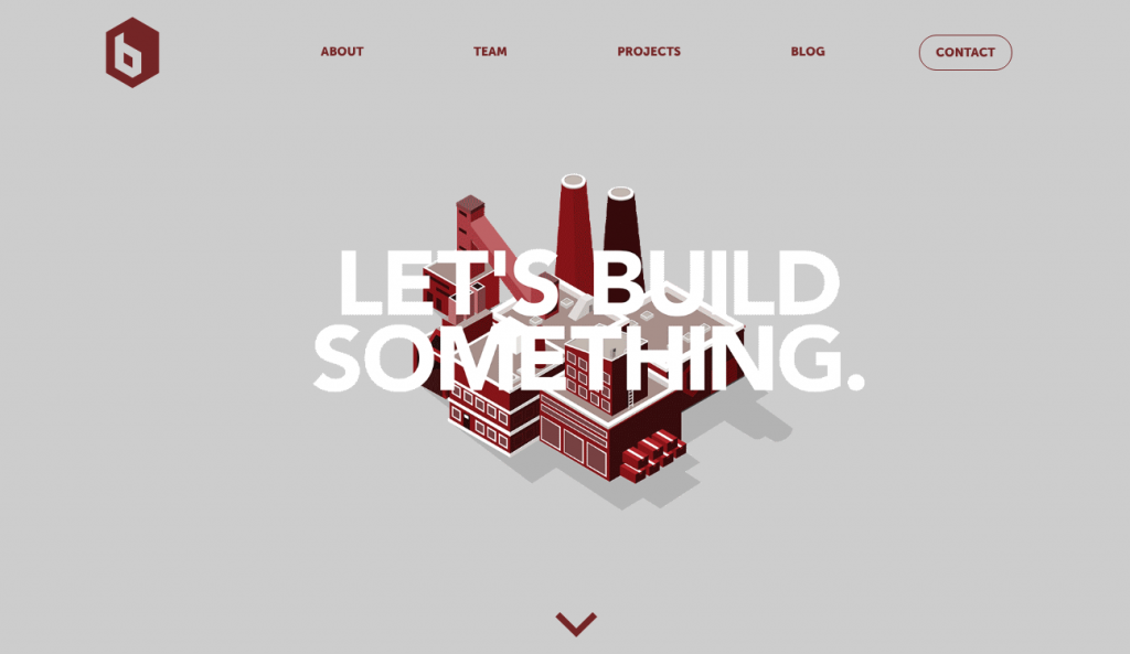
On our Brick Factory homepage we have a hero area that includes an animation of a construction site and our tagline: Let’s Build Something.  Let’s assume that we want to change that to be a background video instead with our catch phrase overlayed on top of the video.

Example of an Incomplete Story

Below is an example of a vague and incomplete user story that you might see to complete this task.

[Story] Homepage: drop in video

We received a video that we want to drop in on the hero area of the homepage of the Brick Factory site to replace our current animation.  The words “Let’s Build Something” should be overlaid in the video. Below are links to the resources needed to complete this task:

  • Design comp showing video placement
  • Video Source File

There are a number of issues with this story:

  • The video is actually meant to be for desktop and tablet users only.  For mobile users we want to include an image in place of the video. This critical information was left out of the ticket.
  • We did not mention that we want to optimize the video for desktop audiences in order to make sure load times don’t suffer.
  • We have not provided clear acceptance criteria for the story.
  • Given the different experiences for mobile vs. desktop users, this should be broken into multiple stories.

Improved Story Example

In this case, I would create an overarching story for the updating of the hero area and include subtasks for the desktop and mobile implementation.  Below are examples of the revised stories.

[SubTask 1] Insert background video on site homepage for desktop and tablet users

Currently in the hero area of the homepage we display an animation to desktop and tablet users.  We would like to replace this animation with a background video with our tagline (“Let’s Build Something”) overlayed via CSS.  We want to make sure the video is optimized for web use so as not to increase load times.

Below are links to relevant files and resources:

  • Design comp showing placement
  • Video File

Definition of Done:

  • Optimize video for web usage.  Ideally we would like the background video to be less than 500 MB.  
  • Insert video in homepage in area currently occupied by the animation.  This should only be shown to desktop and tablet users.
  • Overlay our catch phrase (“Let’s Build Something) over the video as shown in comp.  The catch phrase should drop in 1-2 seconds after video loads.

[SubTask 2] Insert fallback image for homepage hero area for mobile users

We have created a ticket for inserting a background video for desktop users in the hero area of the homepage.  For mobile users, we want to display an image (attached) as a fall back to ensure the site loads quickly on phones.

<Attached Image>

Definition of Done:

  • Configure the hero area so that the attached fallback image appears for mobile users.  Desktop and tablet users should see the video.
  • Overlay our catch phrase (“Let’s Build Something) over the video
  • Double check and make sure that the background video does not load for mobile users. 
About the Author
Todd Zeigler
Todd Zeigler serves as the Brick Factory’s chief strategist and oversees the operations of the firm. In his sixteen year career in digital, he has planned and implemented campaigns for clients including the Pickens Plan, International Youth Foundation, Panthera, Edison Electric Institute, and the American Chemistry Council. Todd develops ambitious online advocacy programs, manages crises, implements online marketing strategies, and develops custom applications and software. He is bad at golf though.