When creating a website, the footer is often designed as an afterthought. They are the least exciting part of the design, so are often put together without much intention.
This is a mistake and a missed opportunity. Every component of your website offers an opportunity to communicate with your audiences.
In this post, I explore common mistakes people make when designing footers and offer tips on how to design an effective footer for your website.
An old-school footer design approach that can be retired for good is repeating your entire site navigation system in the footer and/or trying to stuff your footer with keywords. Here is an example of this approach from Forbes:
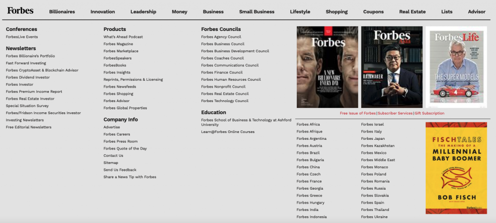
While overloading your footer with links may have been a valid SEO strategy ten years ago, Google and other search engines now devalue footer links. Links you add to your footer are going to have abysmal click-through rates and aren’t going to improve your SEO at all.
More importantly, in most cases, all these links aren’t going to provide any value to your site visitors. Most users aren’t going to have the patience to wade through a sea of links.
In 2021 it makes no sense to design your footer for search engines instead of human beings.
Back in the days when blogging ruled, including links to websites of your friends or partners was an accepted practice. It was a way to both drive traffic to the sites of friends and to impart them with some SEO juice.
Due to widespread abuse of the tactic, Google may now punish you for including too many external links. If you need to link to an external site in your footer, it is recommended that you use the NoFollow tag.
At this point, most Internet users know instinctively that certain information is likely to be included in the footer as opposed to the main site navigation. Users will instinctively scroll to the bottom of the page in search of this information.
This is the type of boilerplate information that is useful to include in a site footer:
In its very simple footer, Google pretty much only includes critical information like this.

As an extension of this boilerplate information, many nonprofits will include a short mission statement that explains what they do. The Gates Foundation is an example of an organization that takes this approach.
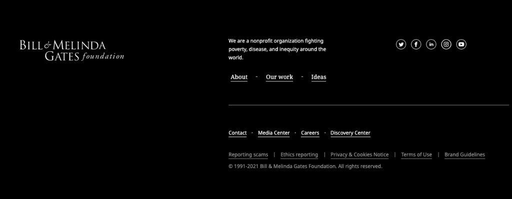
This is an effective way to subtly educate visitors on the mission of your organization and website.
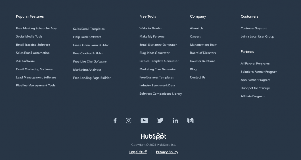
While including your entire sitemap in your footer doesn’t make sense, it can be effective to link to some of your most critical content. Many users will come to your site from search and will hit the footer after reading whatever page brought them to your site. Including links to your best content can be a good way to improve your site’s stickiness and overall effectiveness.
Hubspot is an example of a site that takes this approach. They include links to some of the free tools they provide as well as popular features of their product in their footer. While they include a bit too much information, I think their footer is effective at getting visitors to explore their site.
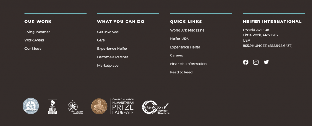
The nonprofit Heifer International does a good job of using its footer to succinctly communicate the mission of the organization and to provide links to critical organizational content.
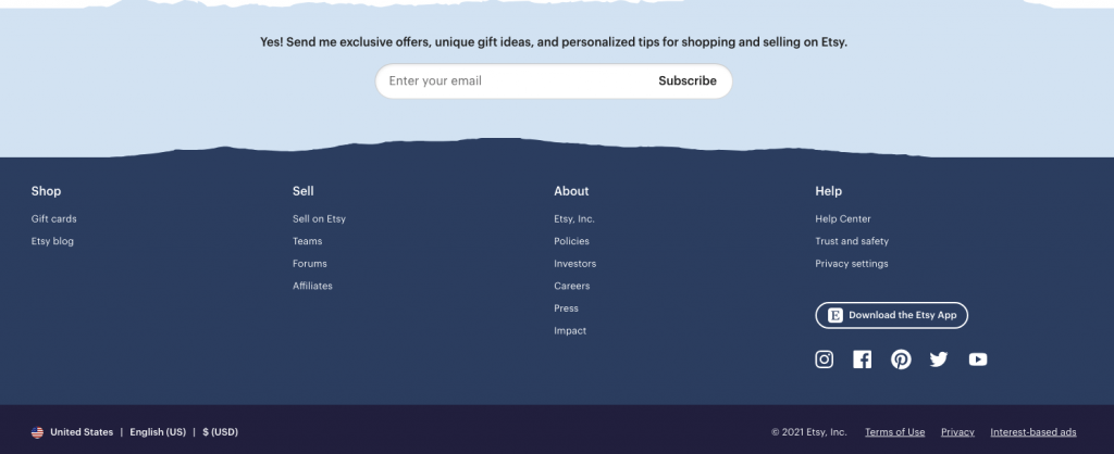
The footer can also be used to drive action. Etsy uses its footer to encourage people to join its email list.
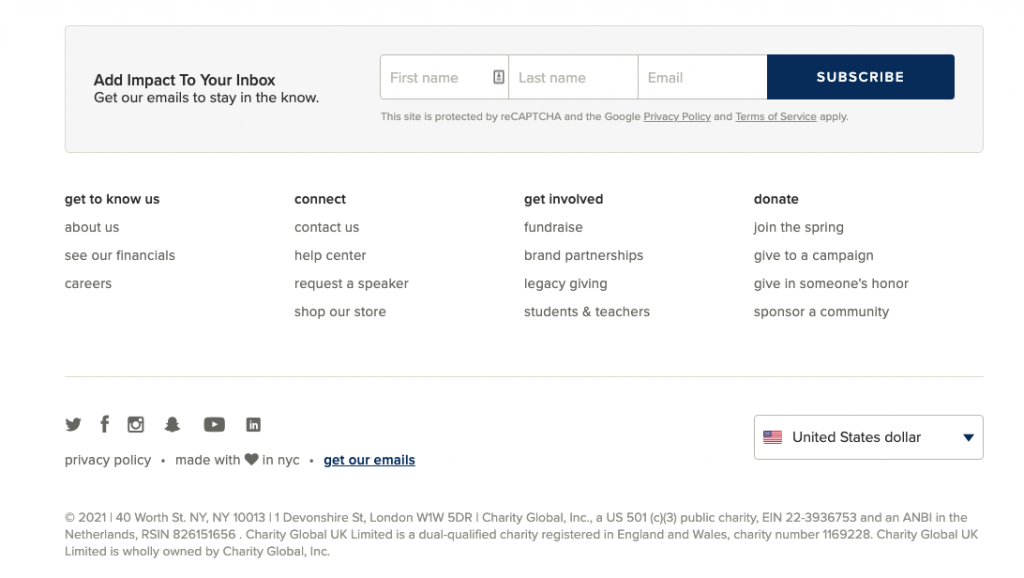
The nonprofit organization charity: water takes a similar approach. Its footer includes links to its best content as well as an email sign-up.
What makes an effective website footer really varies from site to site. At its core, a successful footer should accomplish two main goals:
Brick Factory is a Washington, DC-based team of strategists, designers, and developers who plan and execute digital communications campaigns. We help brands, nonprofits, colleges and universities, and trade associations use digital communications tools to achieve their organizational goals.
Sign up today to have our latest posts delivered straight to your inbox.